Design System Governance
Finding and Implementing the perfect fit of Design System Governance for your organisation
Introduction
This Design System Governance guide was created to lay out instructions and suggestions for best practices to be followed. This guide was not meant to be a rule book. The suggestions that are made here would work for one team and may not make any sense to another team.
A design system can only stand the test of time if that system is constantly used, evolved and maintained by the design system managers in both the Product (UI/UX) Design and by the Front-end Development team. Effective communication and periodical reviews of the design system are two key factors for achieving this. Without periodic reviews, we will often find ourselves with many one-off components that are created for each project but are not added to the Design System. This will further create two problems,
- Product Designers working on other projects won’t be aware of the existing reusable components, which will further lead to them creating a similar one-off variation.
- The front-end team will have to re-develop these components from scratch, which will increase the code size of the product and will be harder to maintain and refactor the code when necessary.
Note:
- This guide/doc was created when I was working at Tata CLiQ and for the design team present at that stage.
- Throughout the doc, the word component is interchangeable for tokens and elements as well.
- Even though a design system and its governance are meant to help its users speed up and produce effective deliverables, it should never limit a designer’s creativity.
Governance Models
In his article, Team Models for Scaling a Design System, Nathan Curtis talks about the three types of governance teams:
1. Solitary
- Here the team managing the system will develop the Design System only for their own need (flow/ product/ project). This team generally is designing the final product UI and is also managing the design system. Due to this, there are high chances that the design system will be mismanaged or abandoned by other users.
2. Centralised
- In a centralised team, there is a dedicated team for managing the design system. They cater to all the requirements of all the teams and can help set up the best processes for new additions and modifications to the design system and increase efficiency and consistency. However, because this team is generally cut off from everyday product design workflow they might not be able completely to grasp the constraints and requirements. And therefore will prioritise the design system over product UI, thereby limiting the product designer’s creativity.
3. Federated
- In this model, different team members from different funnels and products, own the design system. They collectively, and with consensus make decisions to maintain the design system. A product designer representing each funnel becomes part of the design system team for a month or a quarter. This makes sure that there is an equal representation of each funnel/product, which ensures that modification of any token or component will not have any negative effect on another funnel/product. Because there are multiple team members involved, the design system team doesn’t face any kind of bottleneck.
Back when I was working at Tata CLiQ, given its team size at that time and its product structure, the ideal structure was:
- Each team and their members will own a Design System for their Product (Mall, Luxury, Beauty, SP)
- One member of the team will be the owner of their Design System for a month.
- The responsibilities of that person would be:
- Organising syncs (inter and intra),
- Maintaining the design system (Approving new additions or updates, Sanity checks of the new additions (Nomenclature, Autolayout, etc)
- Communicating the changes, and
- Working with product and tech teams to get the design system developed.
- This model will ensure that there is always someone from the team responsible to maintain the Design System, there is no bottleneck (as other team members can quickly switch to that role when necessary) and each project/funnel will get equal representation.
The workflow

Submitting a new request
- Any request for a new component/variant or modification to an existing component/variant should be submitted along with a note, rationalising its existence. Here when the request is submitted, the requester should add a new component or variant to the existing component in the Design System.
- In the case of creating a new component or modifying an existing component, the component should be first duplicated and should be named “ComponentName-Parked”. For example “Input Field-Parked”
- In case of adding a new variant to an existing component, a new variant can have a “-Parked” suffix in the Property Name. For example “Pattern/Flower-Parked.
- While adding a new component or a variant it is expected to aptly use the Auto-layout and follow the correct nomenclature for layers and properties for that design system.
Reviewing and Approving
- Here the reviewer checks why adding this new component/variant makes sense, as opposed to re-using the existing component/variant. There should be a justifiable cause to maintain this in the Product Designer’s and Front-end team’s Design System.
- Once it is rationalised, the reviewer then has to check the correct usage of auto-layout and nomenclature of the new component/variant. If there are any doubts or clarifications needed, those can be taken up in the weekly, bi-weekly syncs or ad-hoc meetings can be scheduled for the same.
- After checking for the technical details, the reviewer should follow the versioning framework. The existing component should be modified or new variants should be added.
- The duplicated version should be renamed it to its appropriate version. In the new component, the variant should be renamed to remove the “-Parked“ suffix.
Publishing the Design System & its Communication
- In Figma, Design System can be published for two reasons,
- Testing:
- Making system-wide changes.
- In case of modification of an existing component, it is highly recommended that it is tested first in real files.
- Since it is mandatory to send out an update to the wider product design, product management and tech team, it is recommended that the Final Release of Design Systems should only be published as per the schedule so that the communication and updates don't overwhelm other teams.
- In case of modification of an existing component, it is highly recommended that it is tested first in real files.
The design system should be published with an appropriate note.
Versioning
In Figma, when the Design System is updated in the main file, it pushes the updates to all the project files which are using that Design System. In most scenarios, the designers can't view the change directly without applying the latest update to that project file. Despite testing, it’s possible that the latest update might break the layout of the designs for that project or it might visually not look as good as the previous version in a given project. Therefore, it’s important to maintain a history of components while updating them in the Design System. This helps in quickly rolling back to the previous design if something is not working as intended.
Steps for versioning
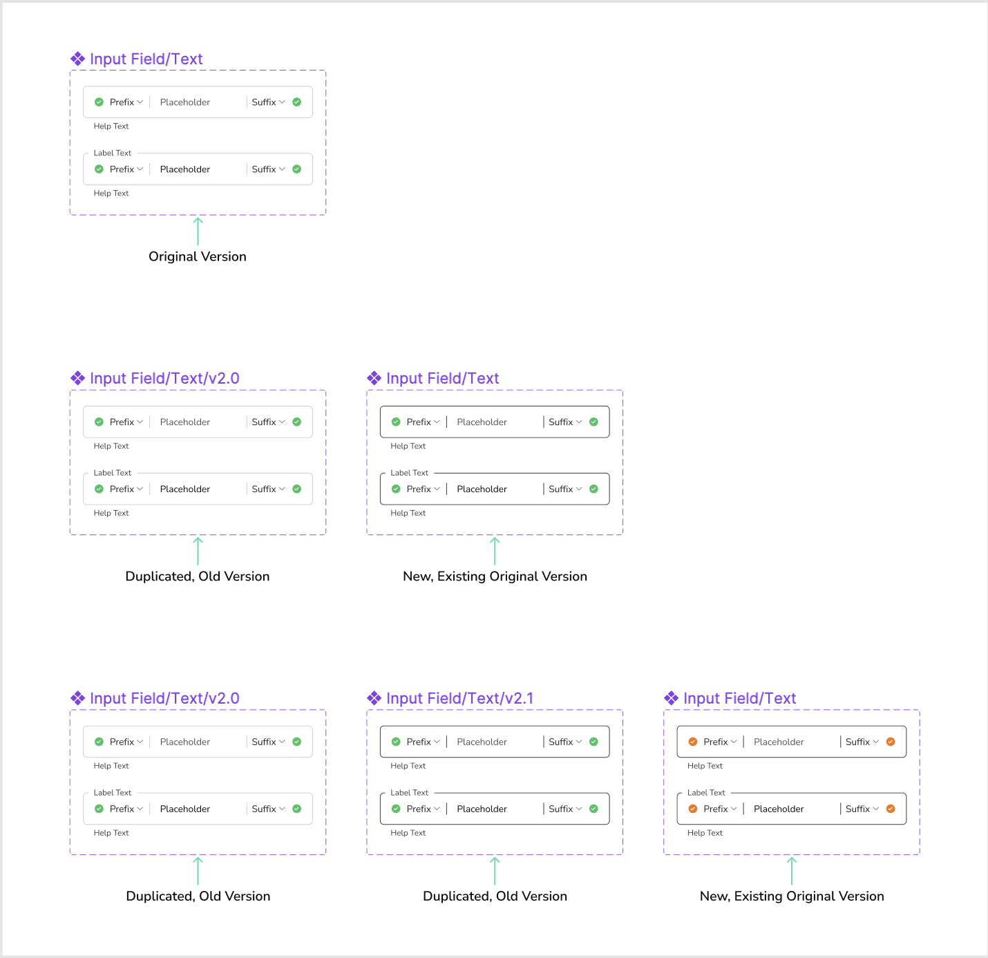
- Copy-Paste the existing component you wish to update.
- Rename the new, duplicated version to its appropriate version.
- Make changes in the existing, original component.
Nomenclature
- Latest Version:
- Input Field/Text/
- Older Versions:
- Input Field/Text/v2.1/
- Input Field/Text/v2.0/
Publishing the Design System & its Communication
- In Figma, Design System can be published for two reasons,
- Testing:
- Making system-wide changes.
- In case of modification of an existing component, it is highly recommended that it is tested first in real files.
- Since it is mandatory to send out an update to the wider product design, product management and tech team, it is recommended that the Final Release of Design Systems should only be published as per the schedule so that the communication and updates don't overwhelm other teams.
- In case of modification of an existing component, it is highly recommended that it is tested first in real files.
The design system should be published with an appropriate note.
Design System Publishing/Update Note
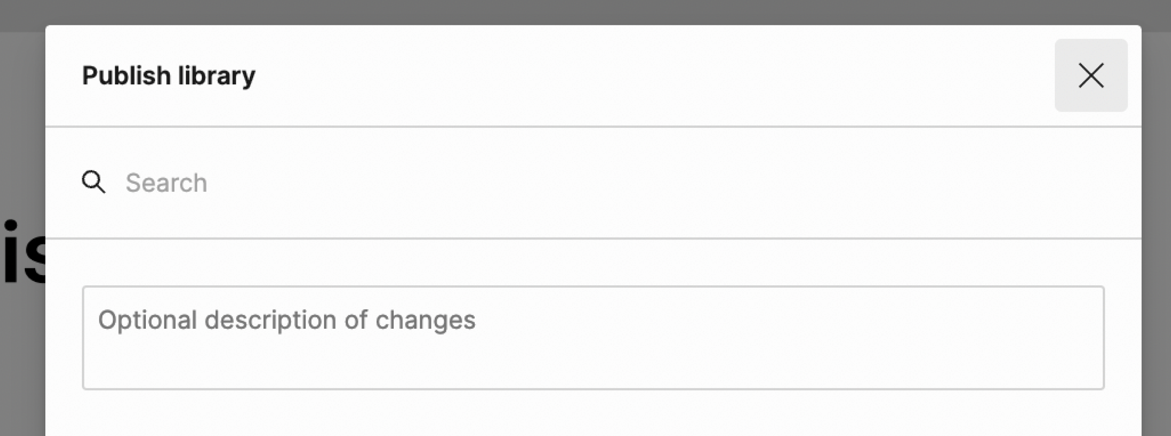
While publishing the library always make sure to add an update note in the description box of Figma. This communication should also be done separately via email to the wider design team working on other platforms, product managers and developers of that platform. The format for this update note is given below.For Figma[Action] [Component] [Change] [Reason]
Type of Release: STAGING or PRODUCTION
Change Log: 12/07/2022
Reviewed by: Name
Published by: Name
Updates:
- [Added] Chips Variants, with new property: Icon on Left (Context, requirement in Filter screen)
- [Edited] Text Input Field Component and its variants. (Previously, the input field was not responsive)
- [Edited] Outline Colour for all input fields (text, dropdown, etc). (Previously, the outline was not visible )
- ...
For Email
Type of Release: STAGING or PRODUCTION
Change Log: 12/07/2022
Reviewed by: Name
Published by: Name
Updates:
- [Added] Chips Variants, with new property: Icon on Left (Context, requirement in Filter screen)
- [Edited] Text Input Field Component and its variants. (Previously, the input field was not responsive)
- [Edited] Outline Colour for all input fields (text, dropdown, etc). (Previously, the outline was not visible )
- ...
The email changelog should be sent out only for Final Release after testing is completed.
Nomenclature
Standard nomenclature is essential to quickly grasp and understand any system. While using any component in a file, designers go through multiple workflows of:
- Quickly searching for a component in the assets panel,
- Changing the properties of the component
- Detaching and modifying the component on the fly
Therefore for ease of use, it’s important to follow a hierarchy and correctly name the layers.The basic naming convention followed in “Vanity - Pallete’s Design System” is of naming and hierarchy of the layers and component properties.
Layer
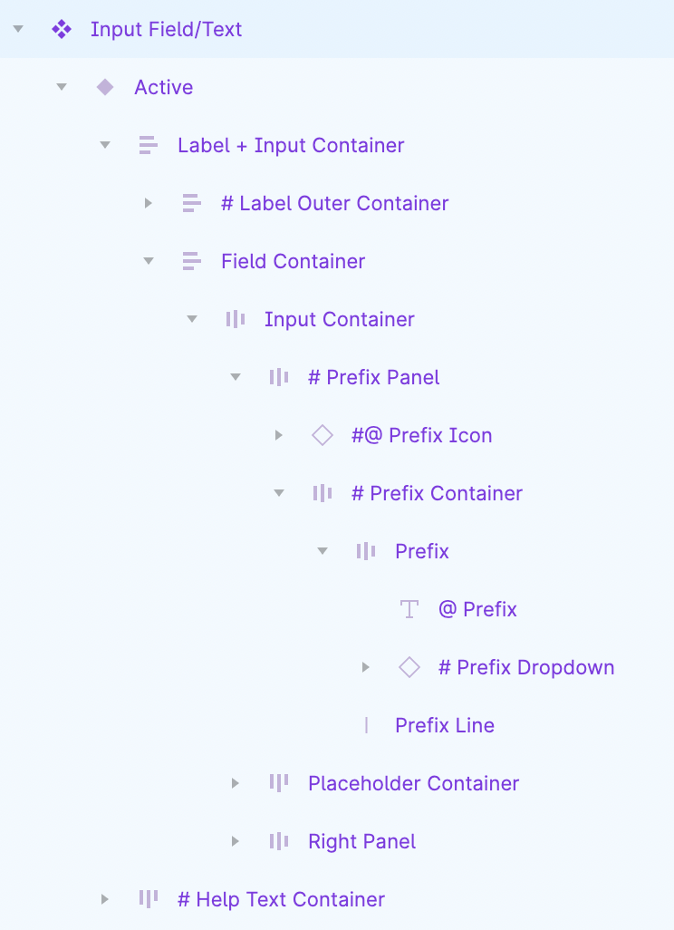
# - Visibility Property Used (Layer)
@ - Modifiable Content Property Used (Text, Instance)
#@ - Combination of above two
Component Property
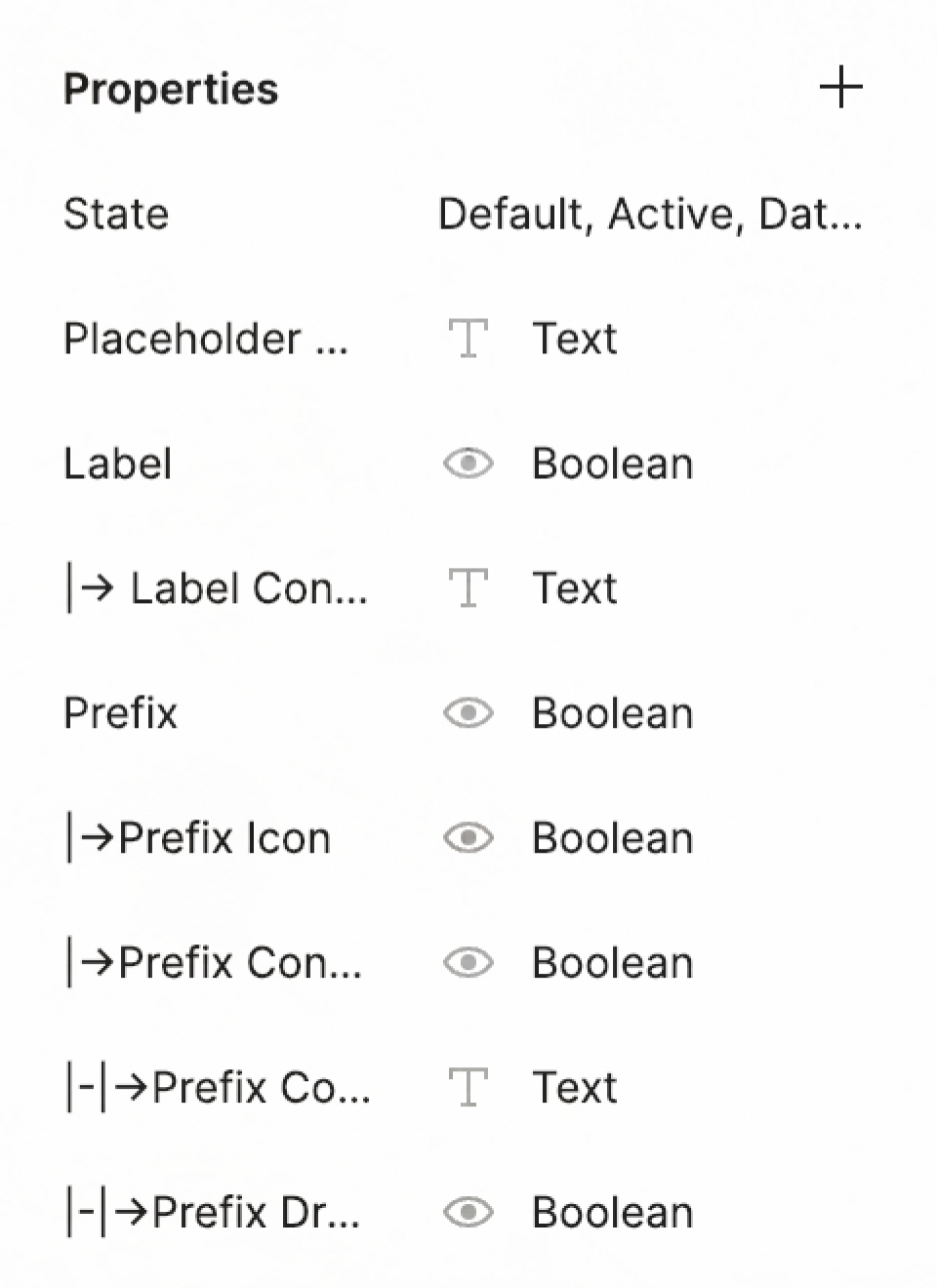
Nesting hierarchy and nomenclature is followed while defining the Component Properties.
→ First
|-|→ Second
|-|-|→ Third
Here’s a fun Twitter thread on Design Systems:
https://twitter.com/delivreal/status/1546898511186247680

Tata CLiQ
Sr. Product Designer
Read more about my work at Tata CLiQ