Daily Mutual Fund SIP
Everyday Product for Everyday Indians!
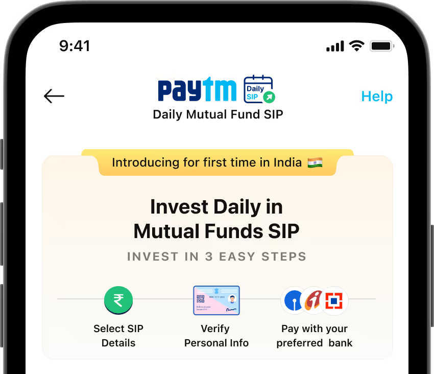
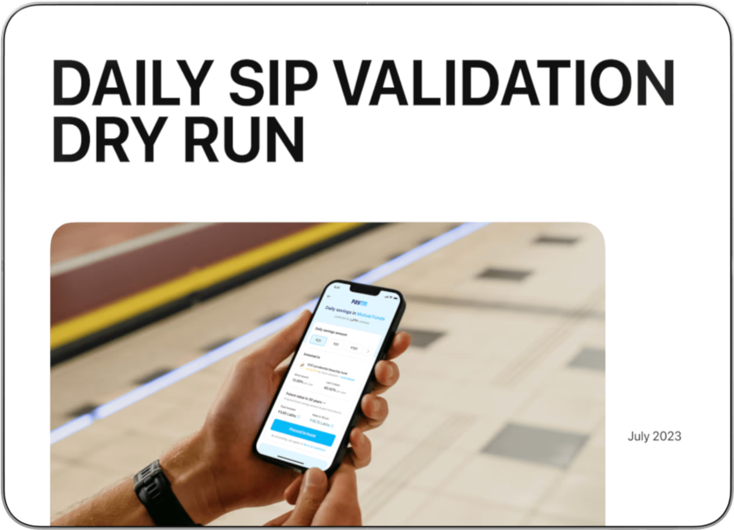
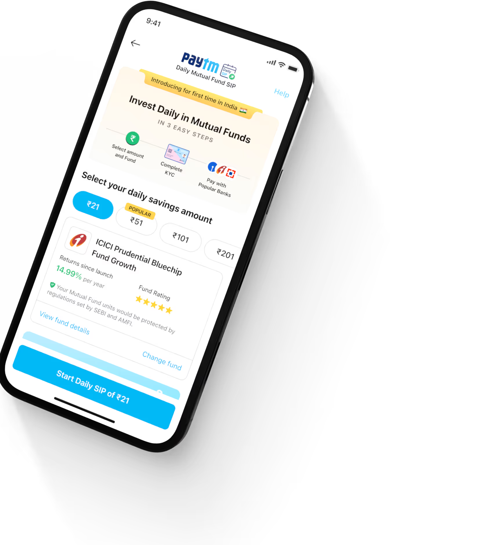
I was part of the team at Paytm, India's leading payment app, where we launched a new investment feature called Daily SIP. We wanted to make investing accessible to everyone, so we kept it simple - our users could start investing with as little as ₹21 per day, with other options up to ₹501. This made investing in mutual funds much more approachable compared to traditional methods, especially for our regular Paytm users across India.
Unique Daily Interval, compared to the standard 1-month interval seen in the mutual fund products.
Only 3 Fund Offering , compared to more than 2,500 fund offerings by 44 Mutual Fund Houses.
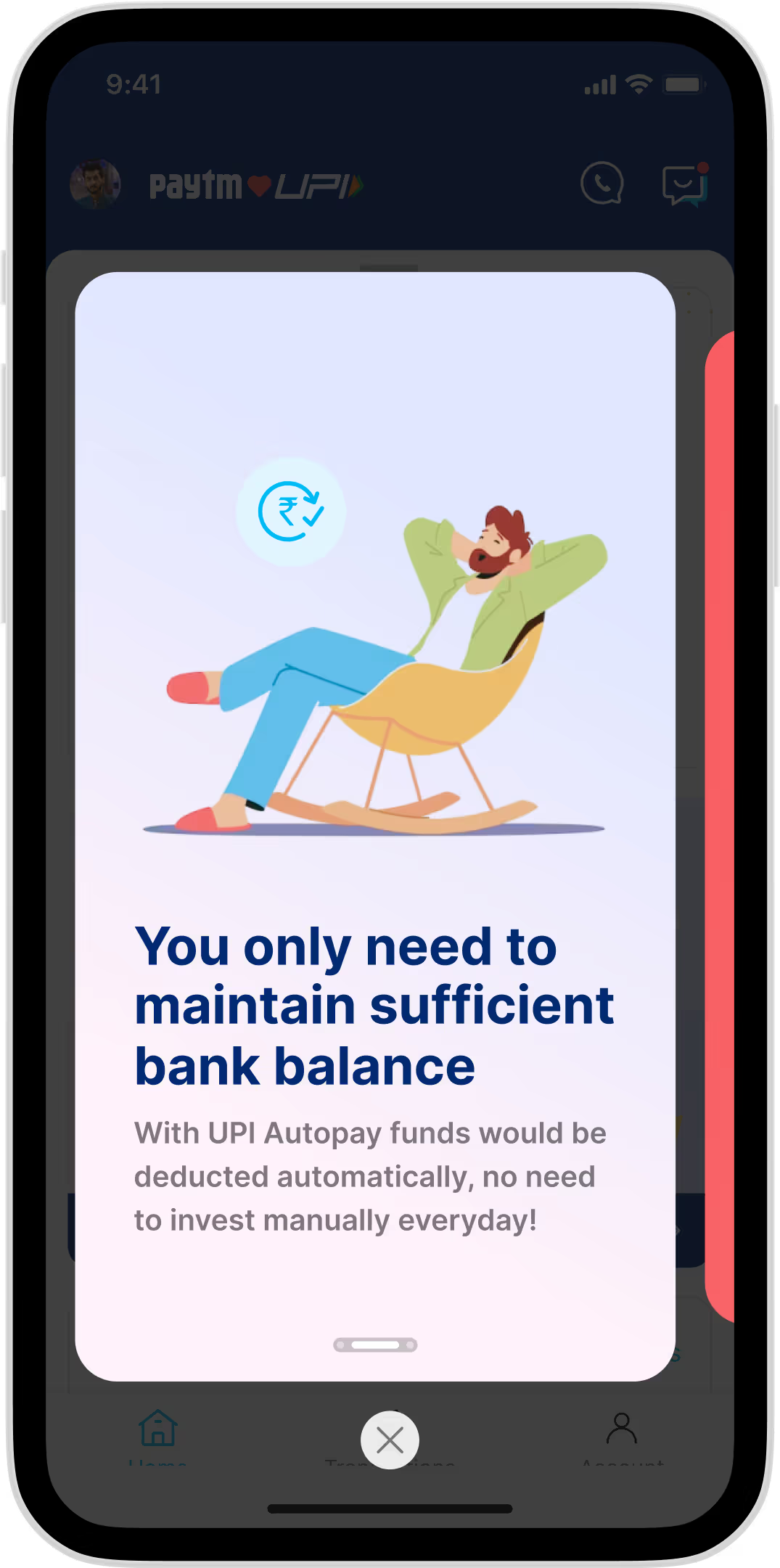
For automatic recurring payments, compared to manual or eNach methods.
I joined the Paytm design team while we were developing a new mutual fund product. The initial design came from our Product Designer Dhanish and Product Manager Harshit, based on requirements from our CEO Varun. As Varun put it, we started with a basic version - like testing the plumbing before decorating the bathroom. We built this in partnership with MFU (MF Utilities), who connects mutual fund companies with distributors like Paytm. When I came on board, my first task was to conduct user research with my colleague Anas to validate the product concept.

I participated in a crucial three-day sprint at our Bangalore office in late September 2024. The entire product team - designers, PMs, and tech leads - came together to map out the Daily SIP product's design, user experience, and content. Each designer was paired with PMs to work on specific parts of the product. During the sprint, I only handled the Onboarding and Post Investment flows, while my colleagues took on different areas: Dhanish tackled the Homepage and mandate setup, Yathiraj developed the Learn section, and Beetho worked on the CST Bot and Fund detail flows. Over the following two weeks, we finalized all product flows and refined the user experience.
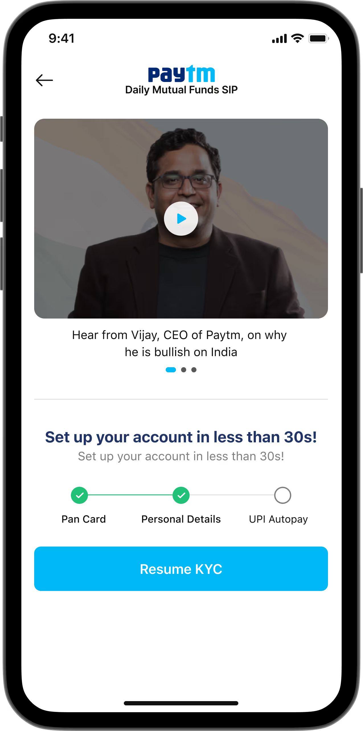
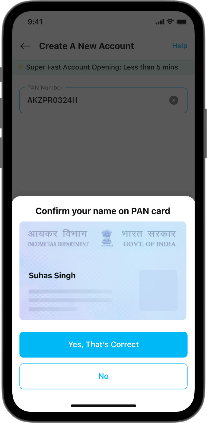
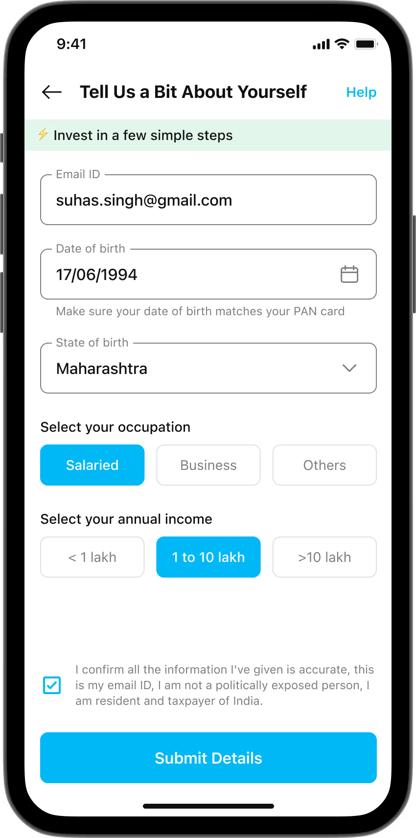
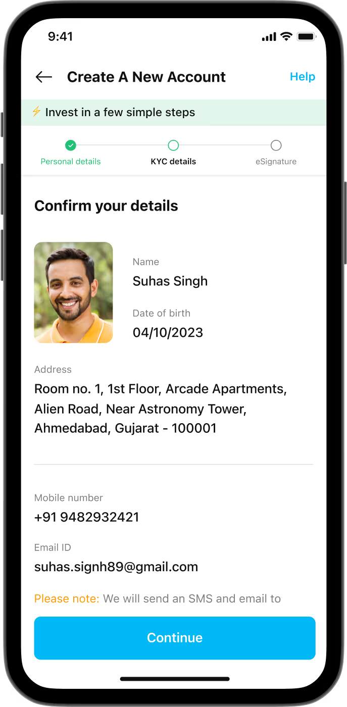
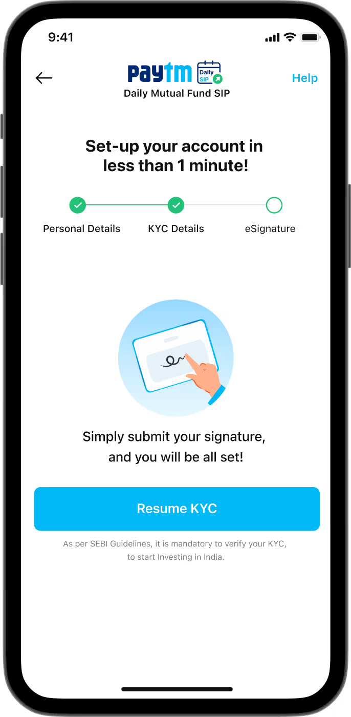
Our goal was to simplify the process of investing in mutual funds by improving how users open demat accounts. In India's regulated markets, opening a demat account can be complex, especially for first-time users. We aimed to streamline the process, and provide users with contextual cues and motivation to complete the onboarding journey

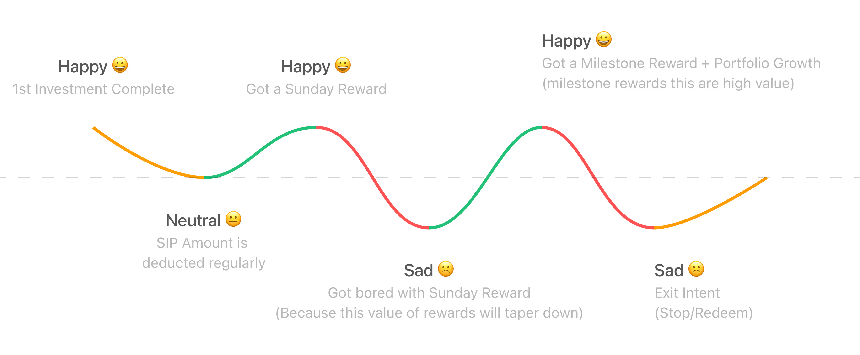
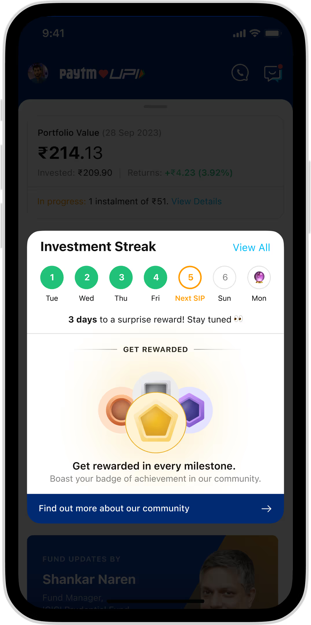
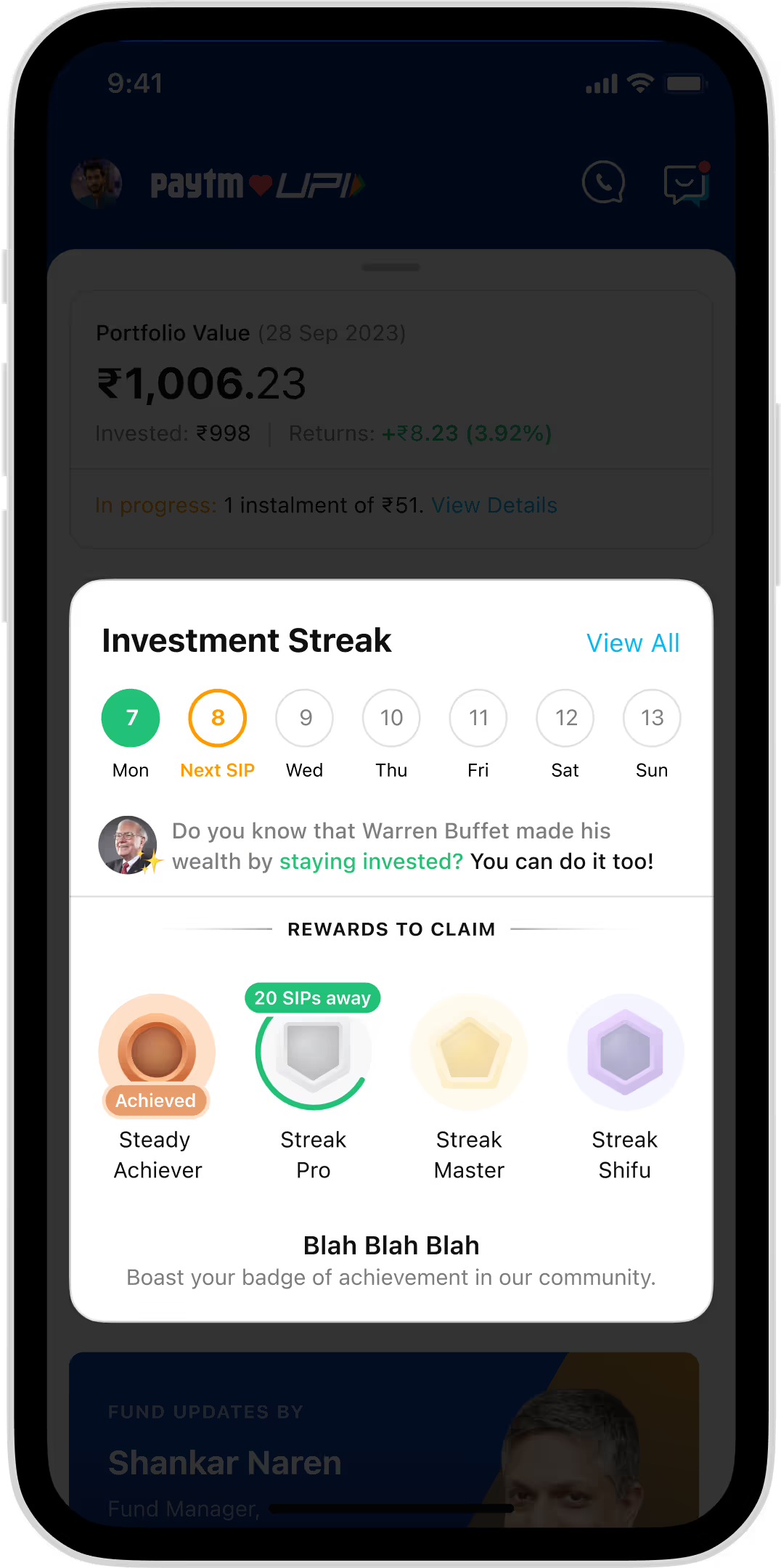
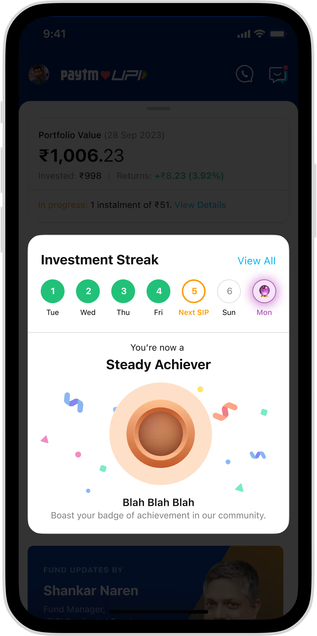
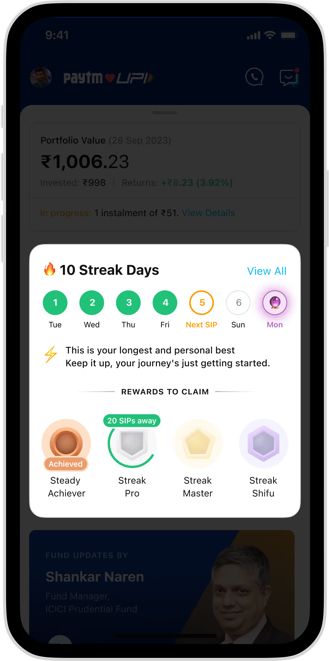
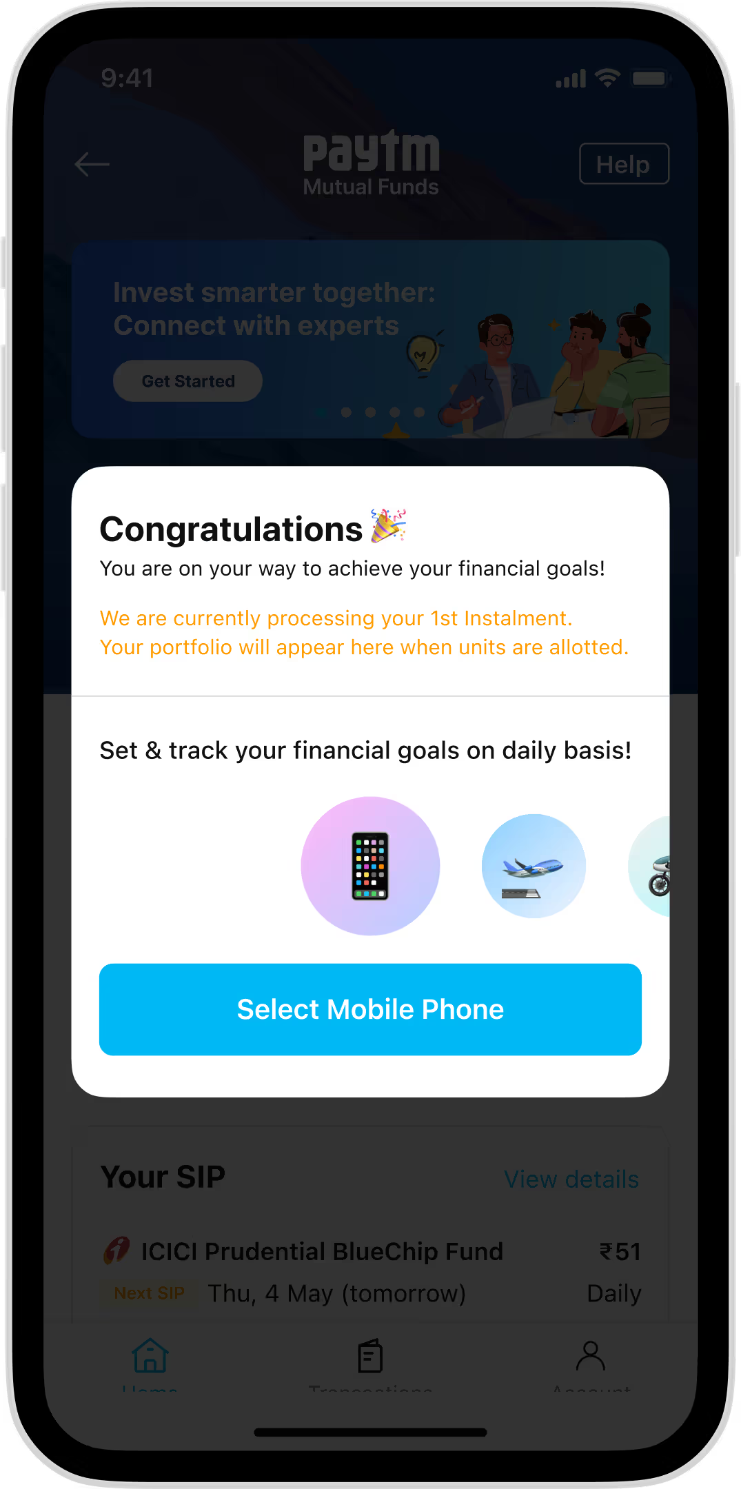
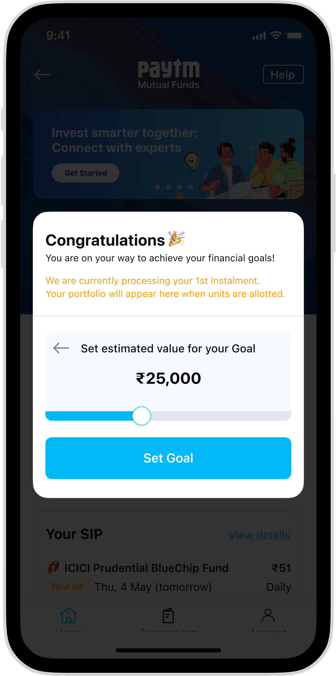
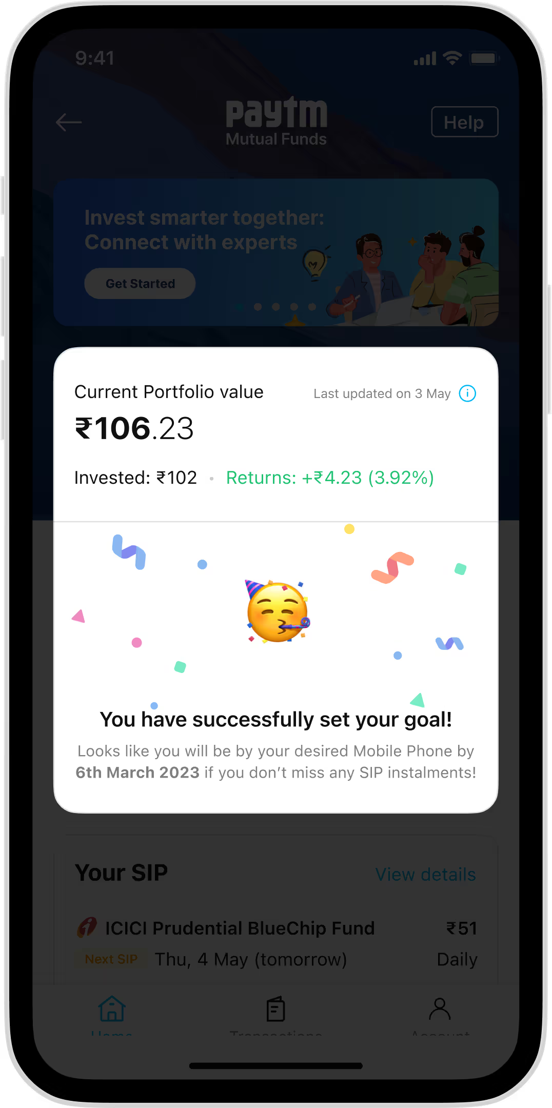
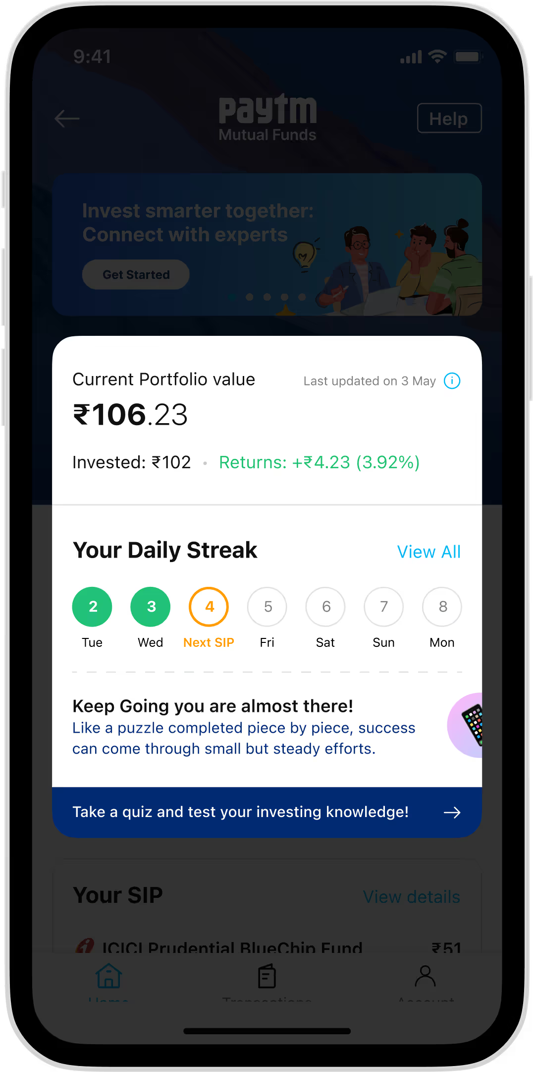
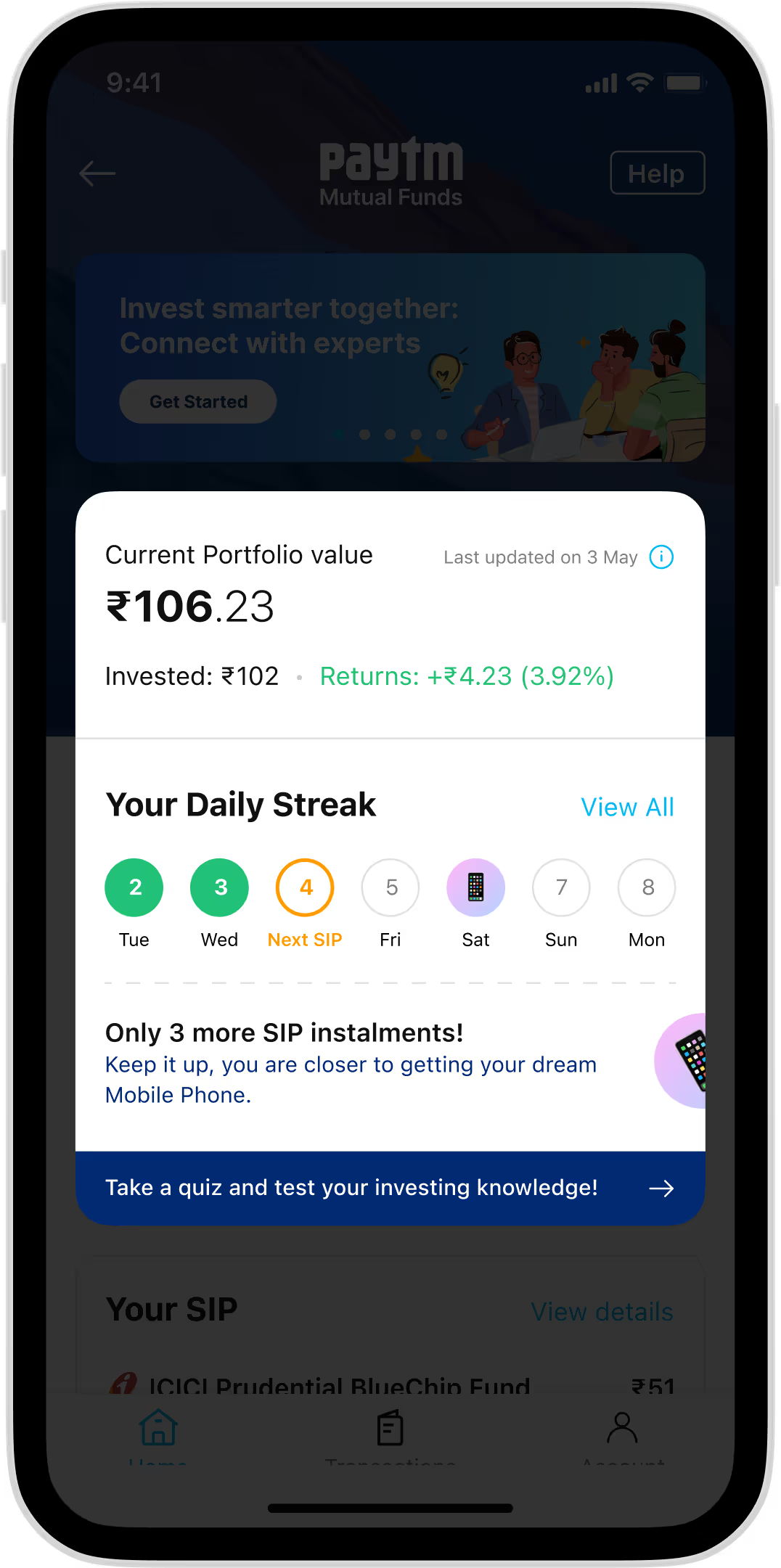
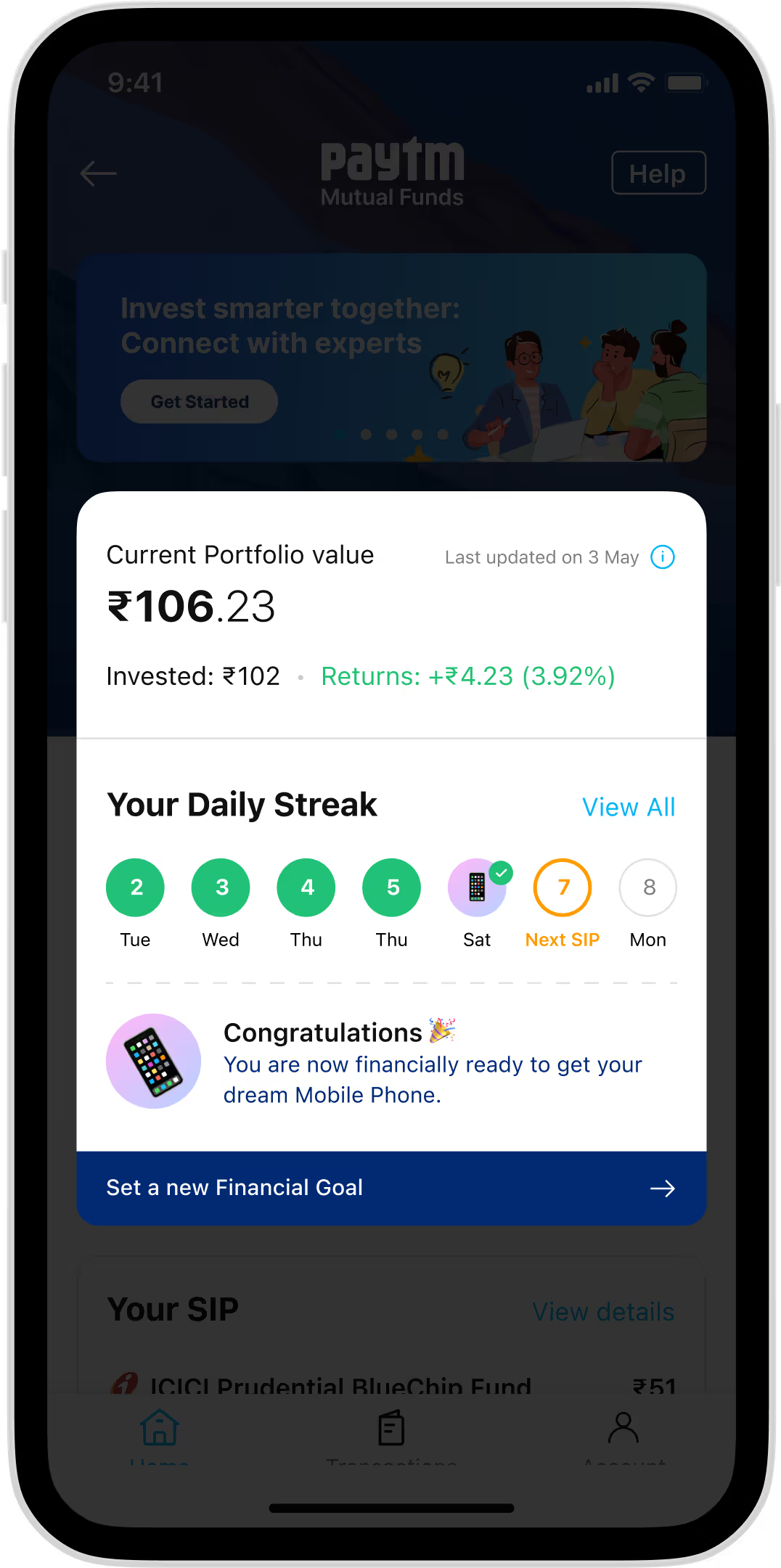
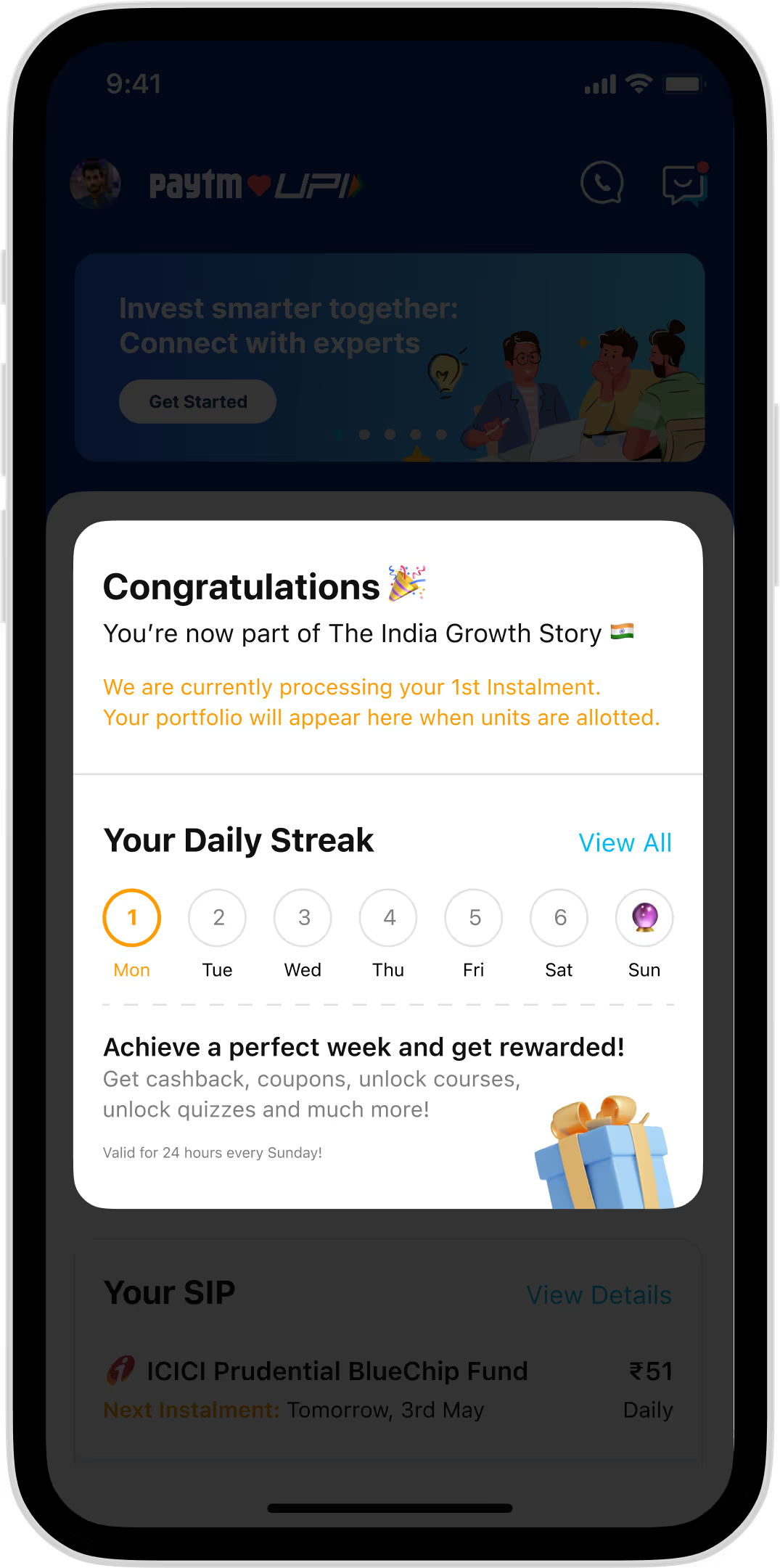
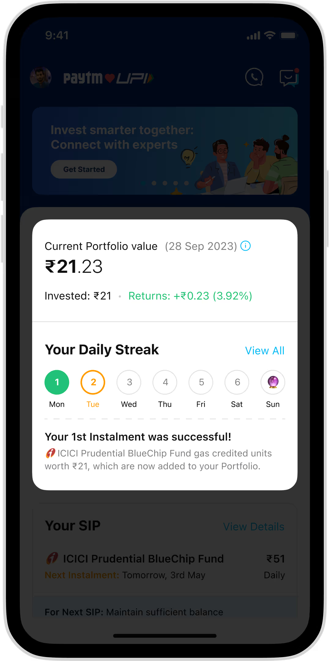
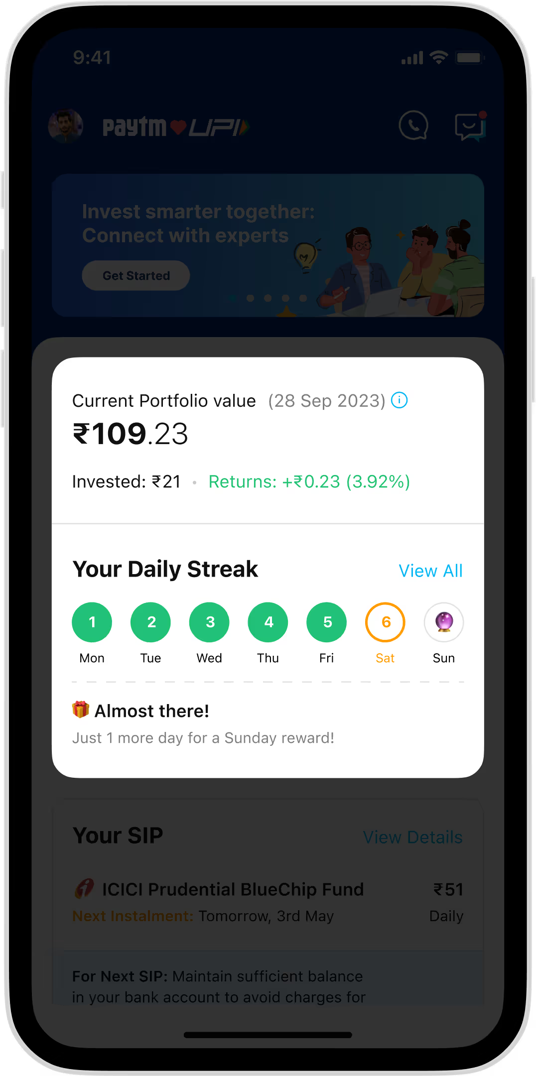
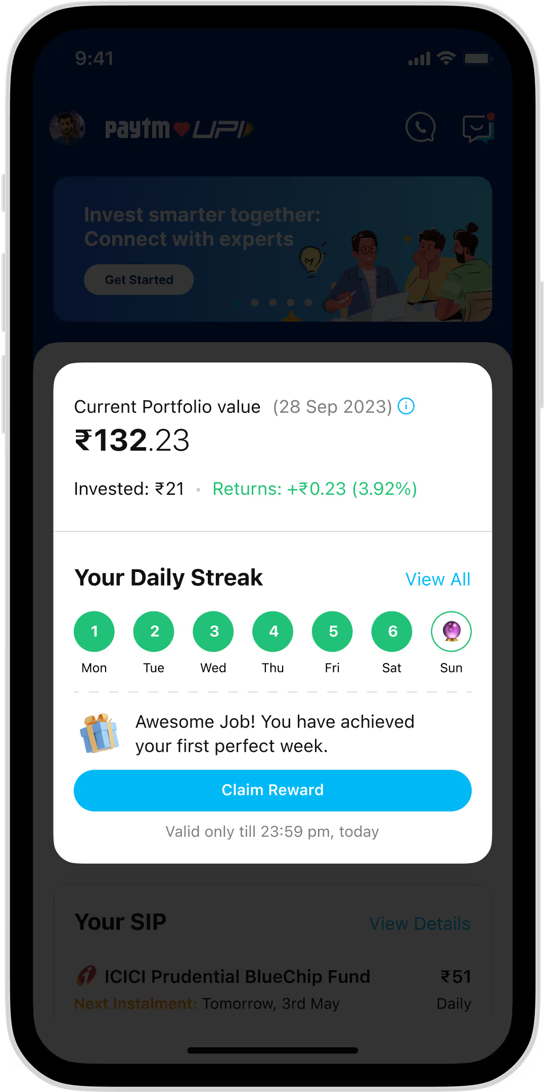
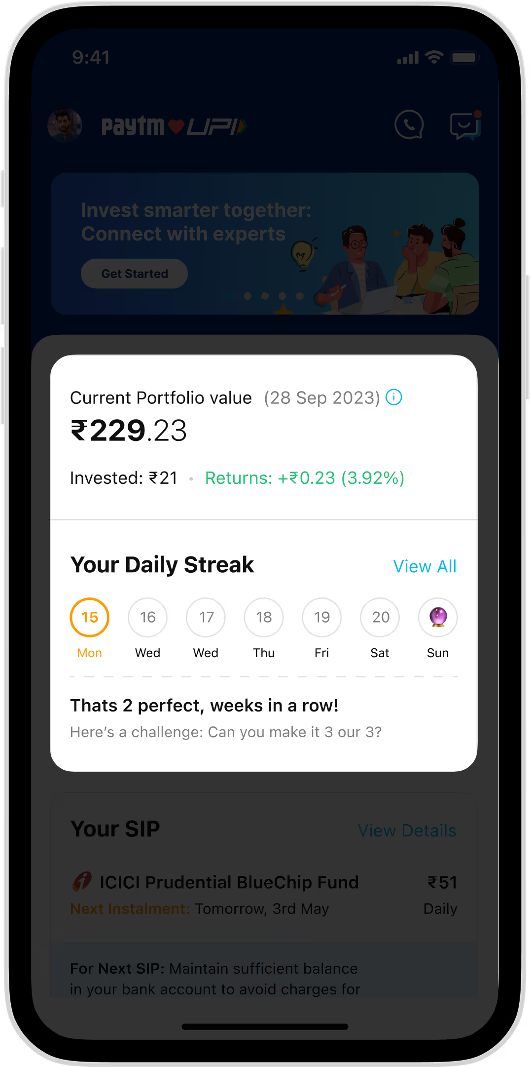
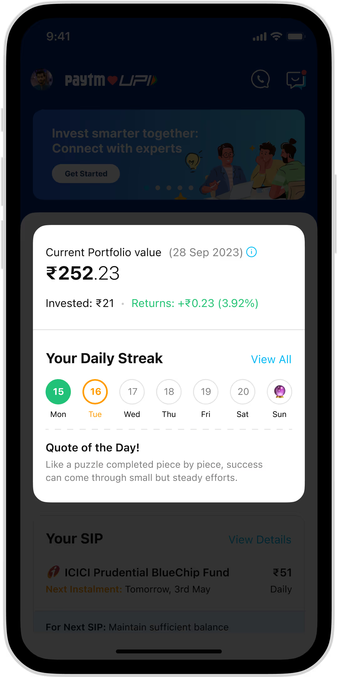
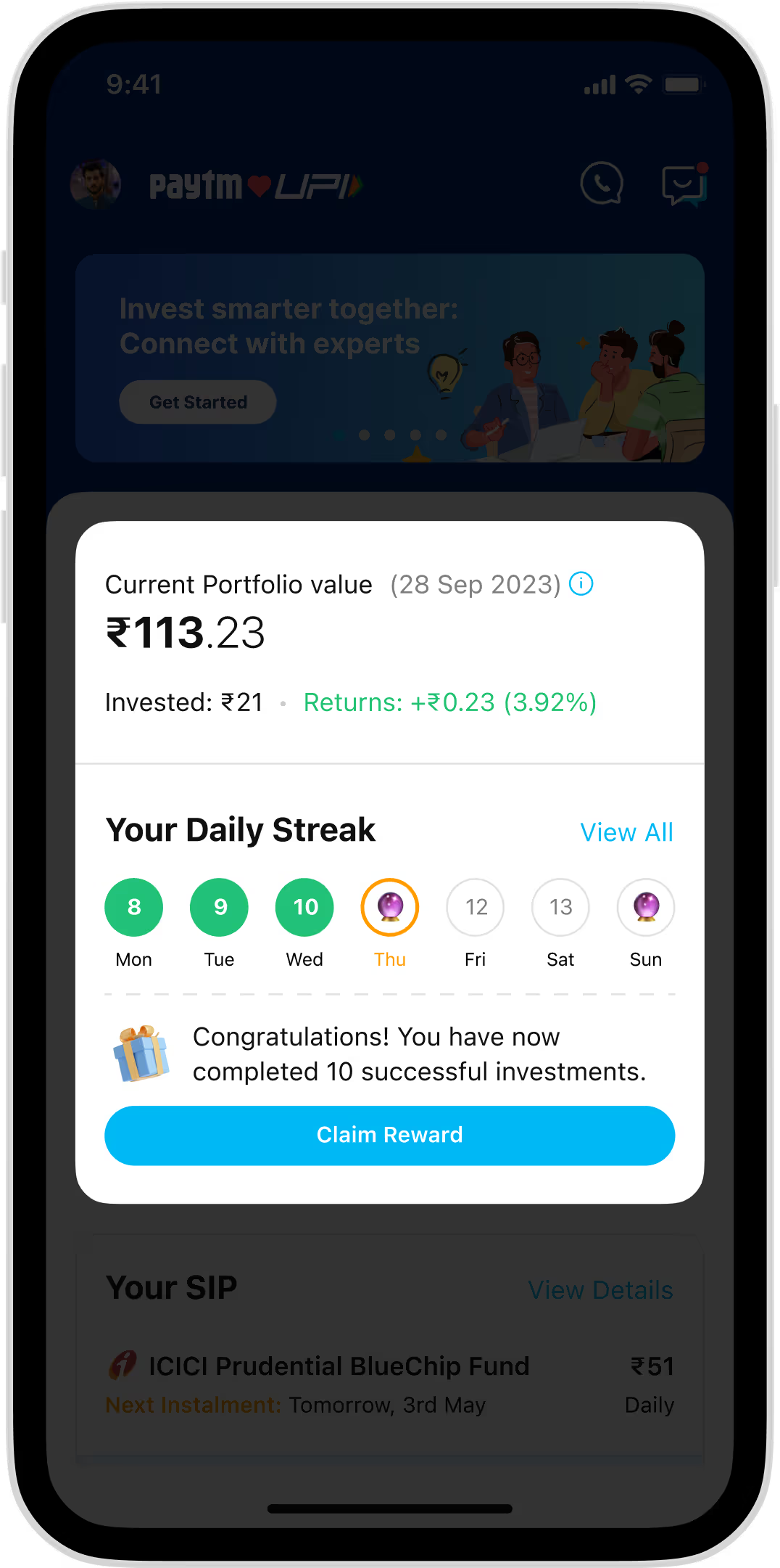
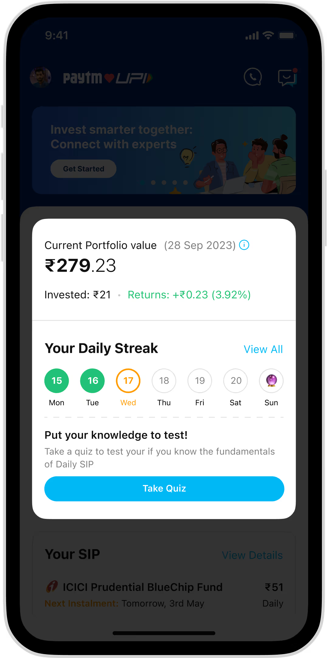
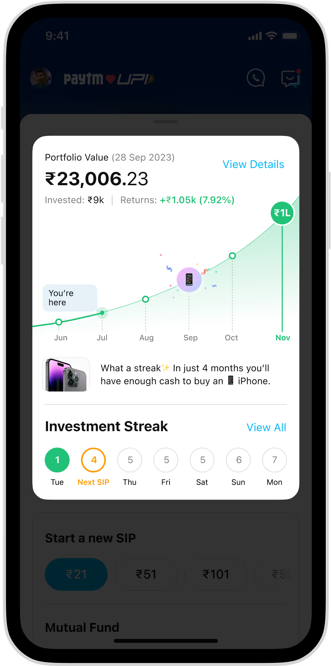
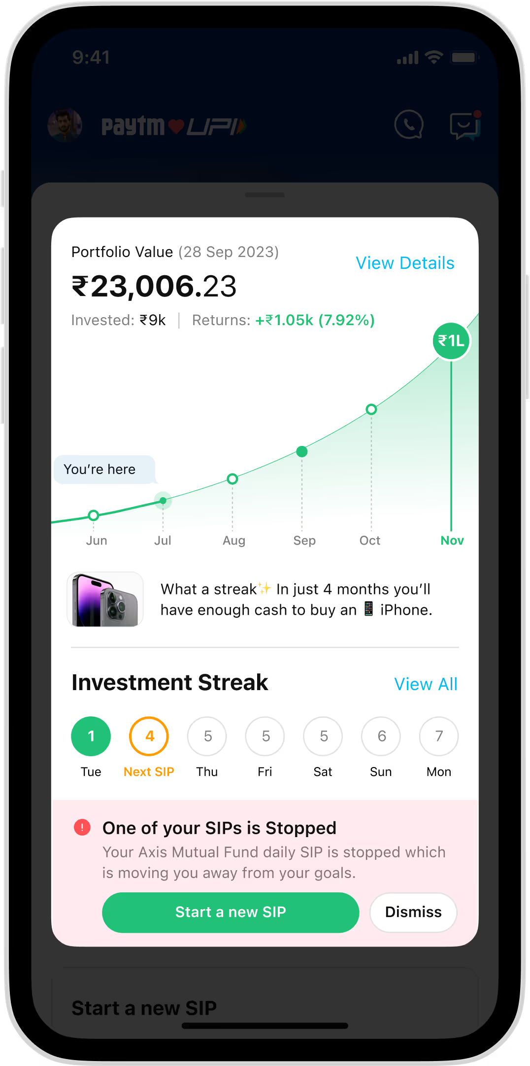
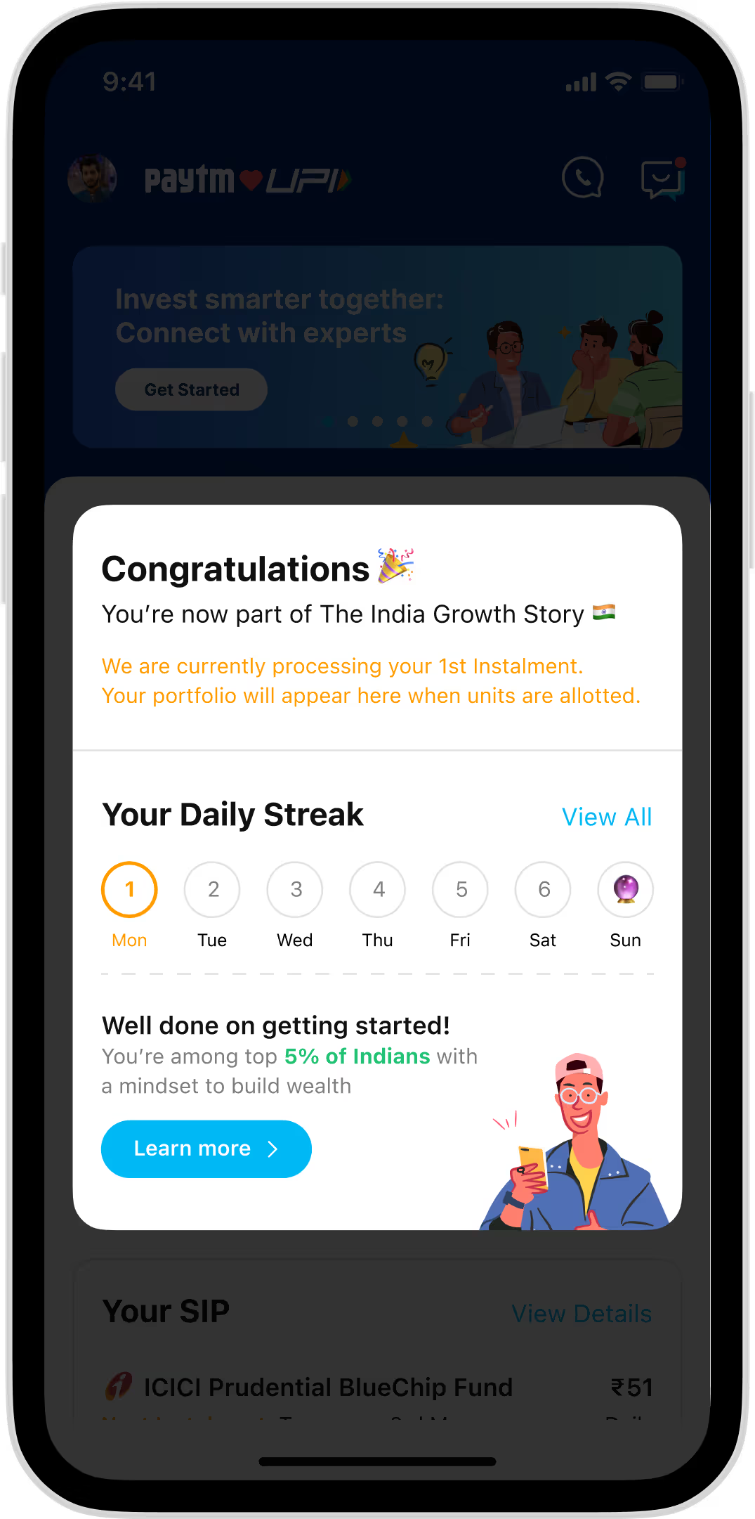
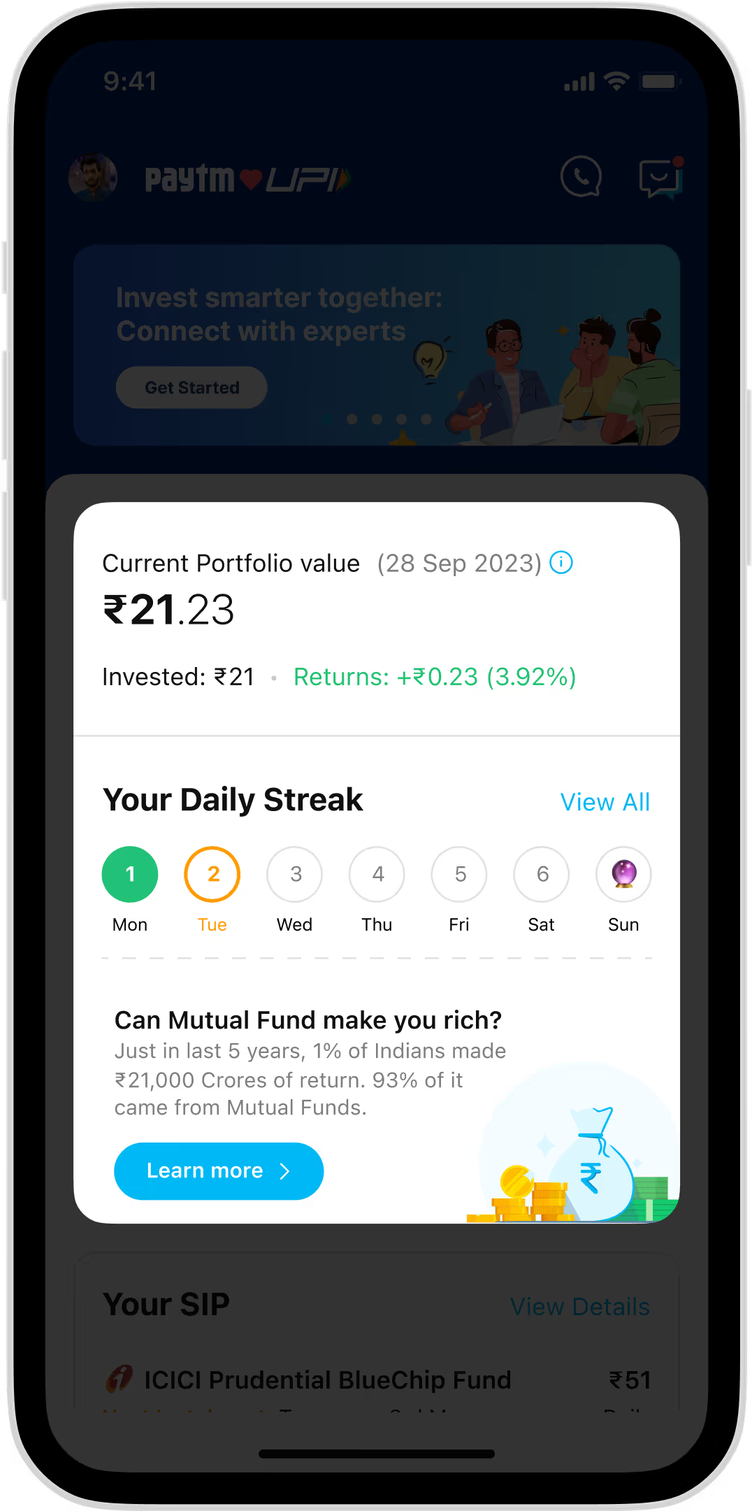
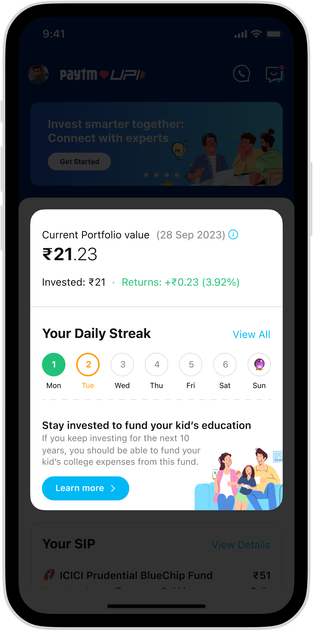
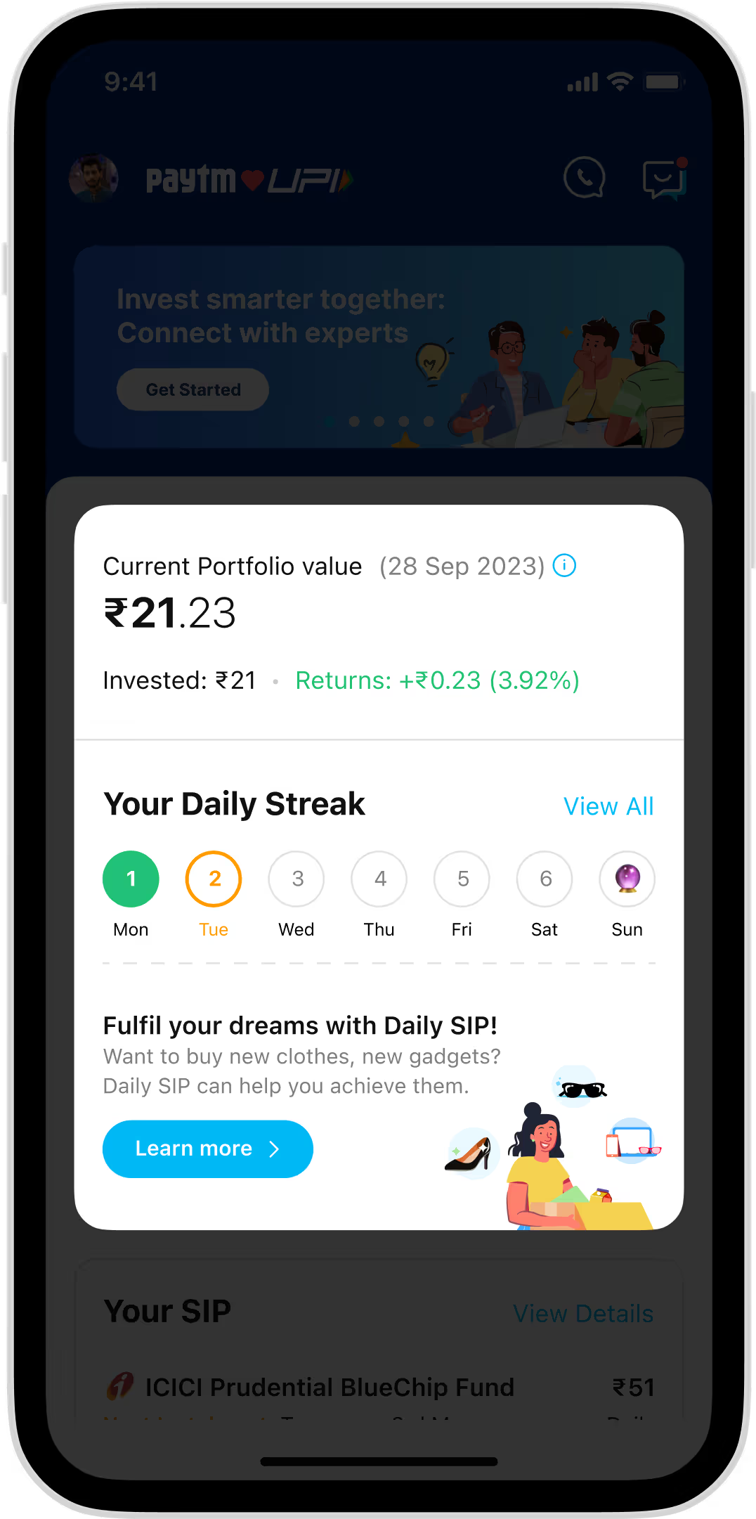
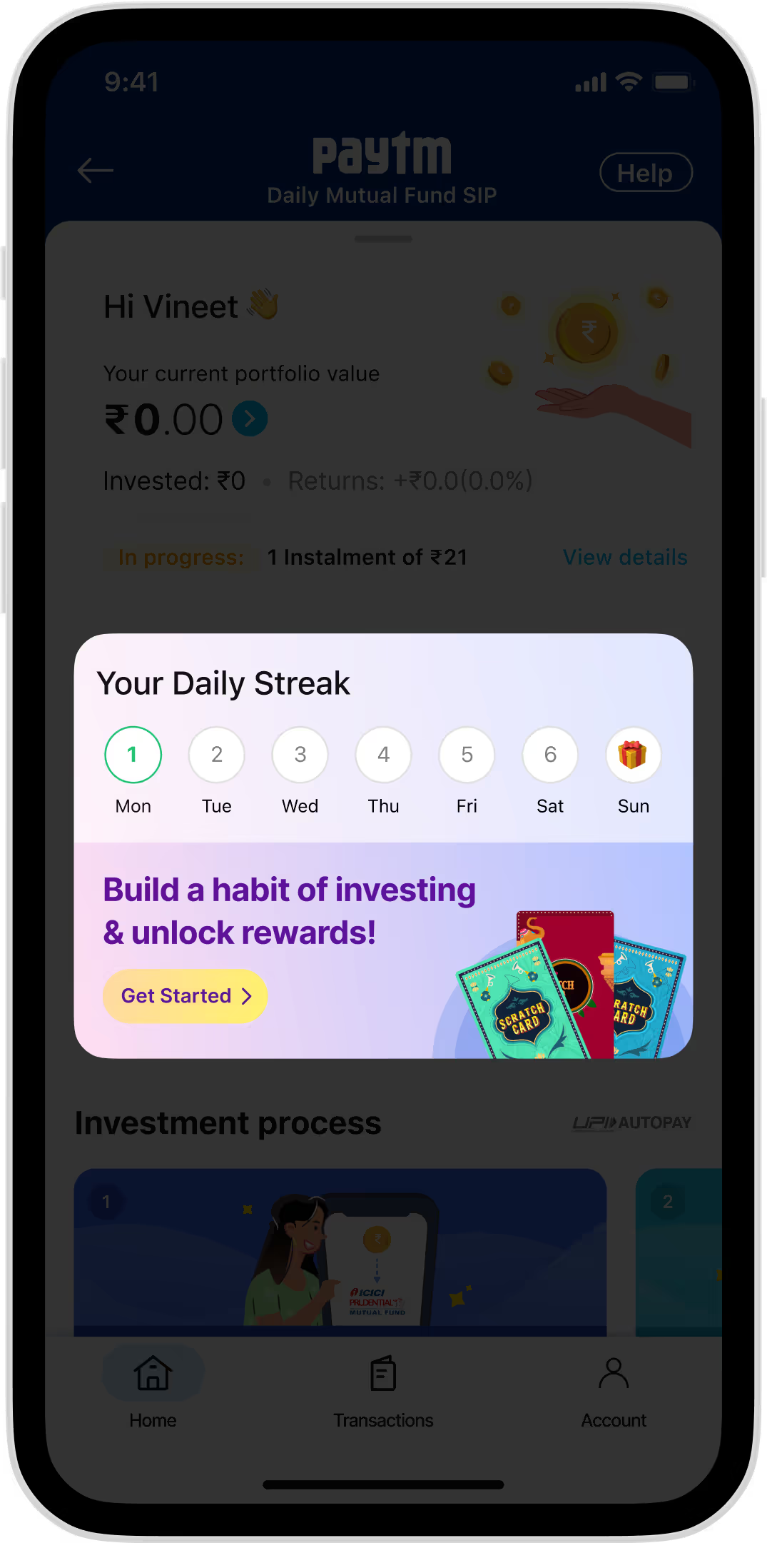
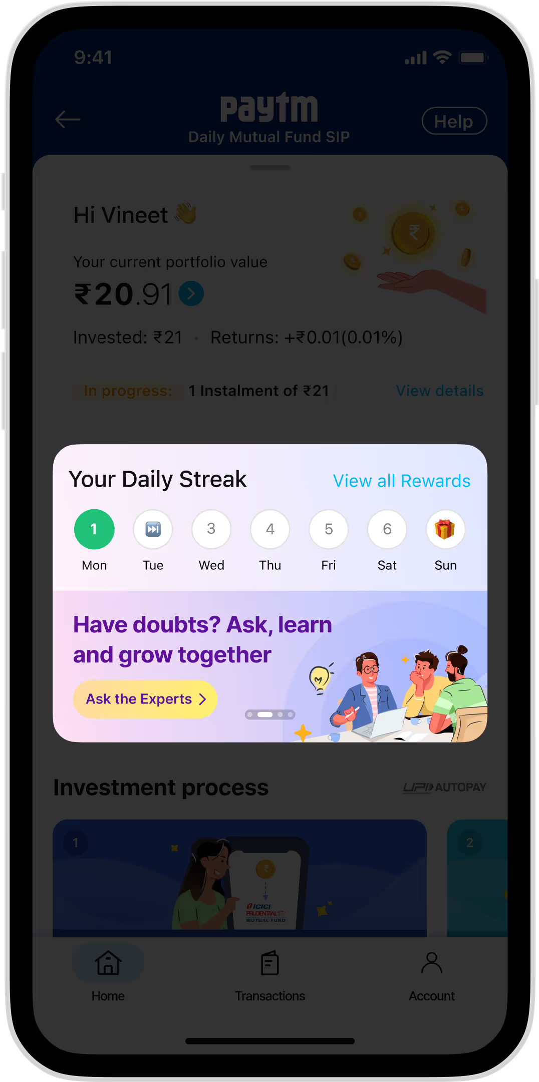
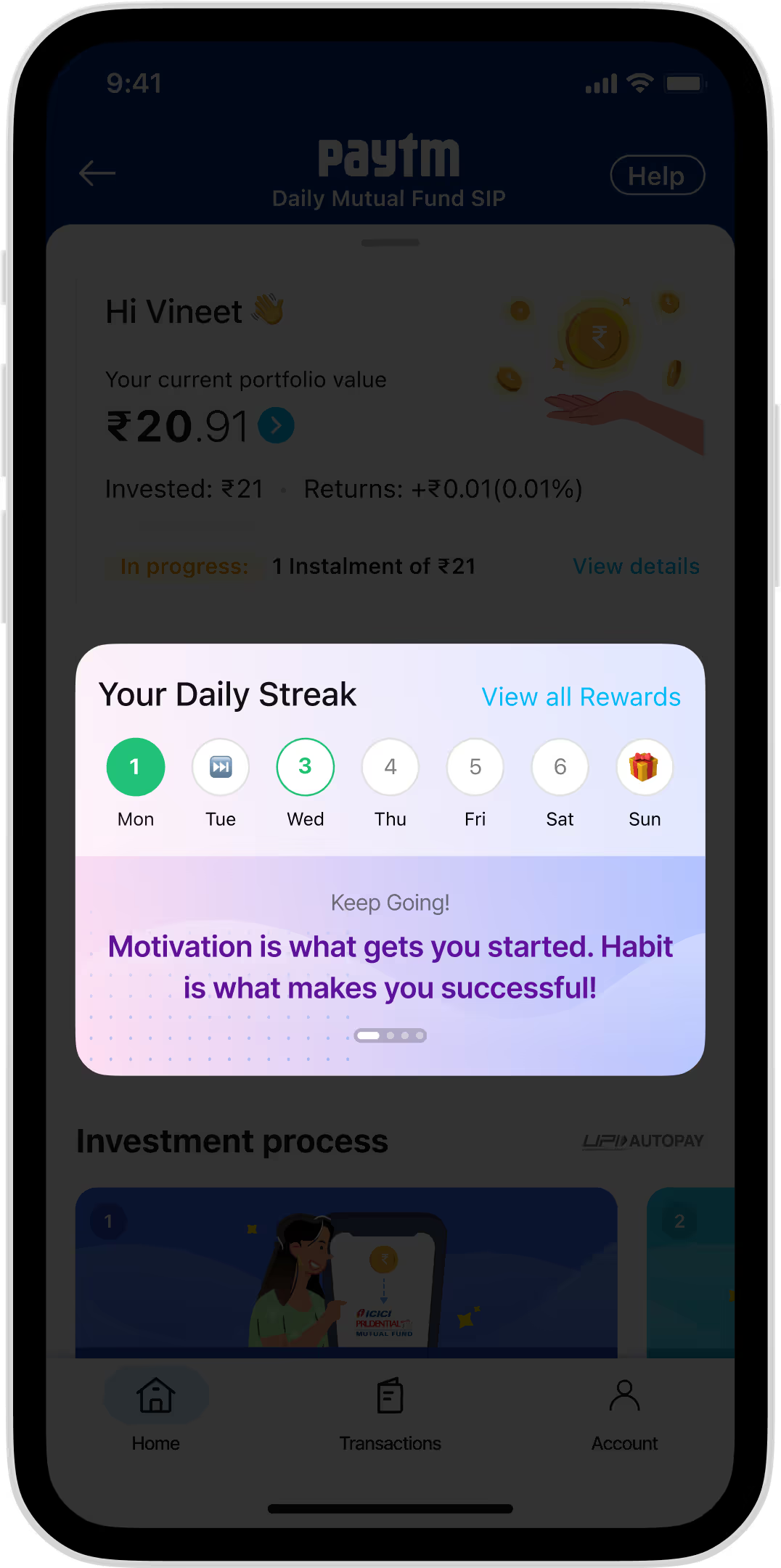
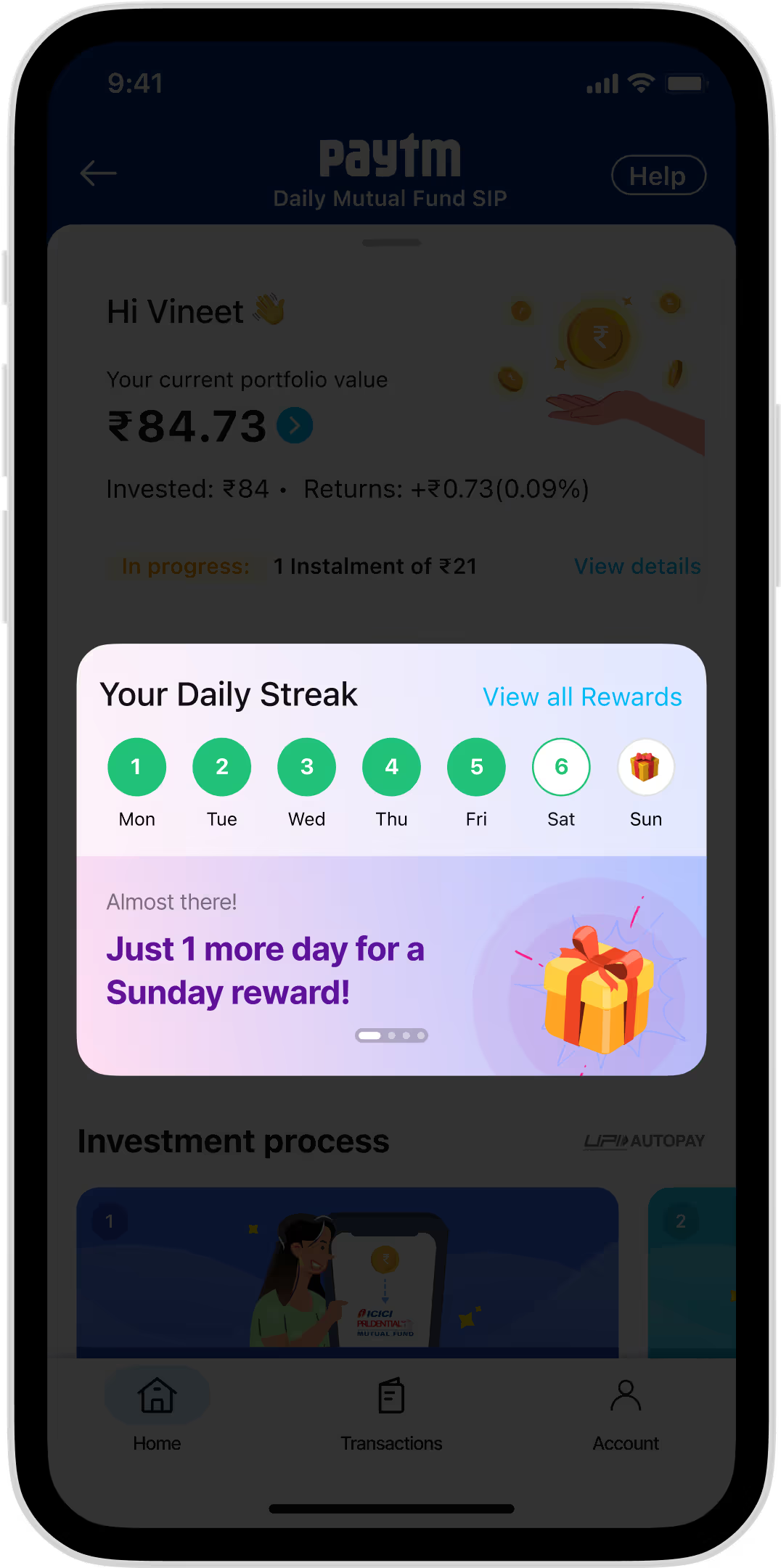
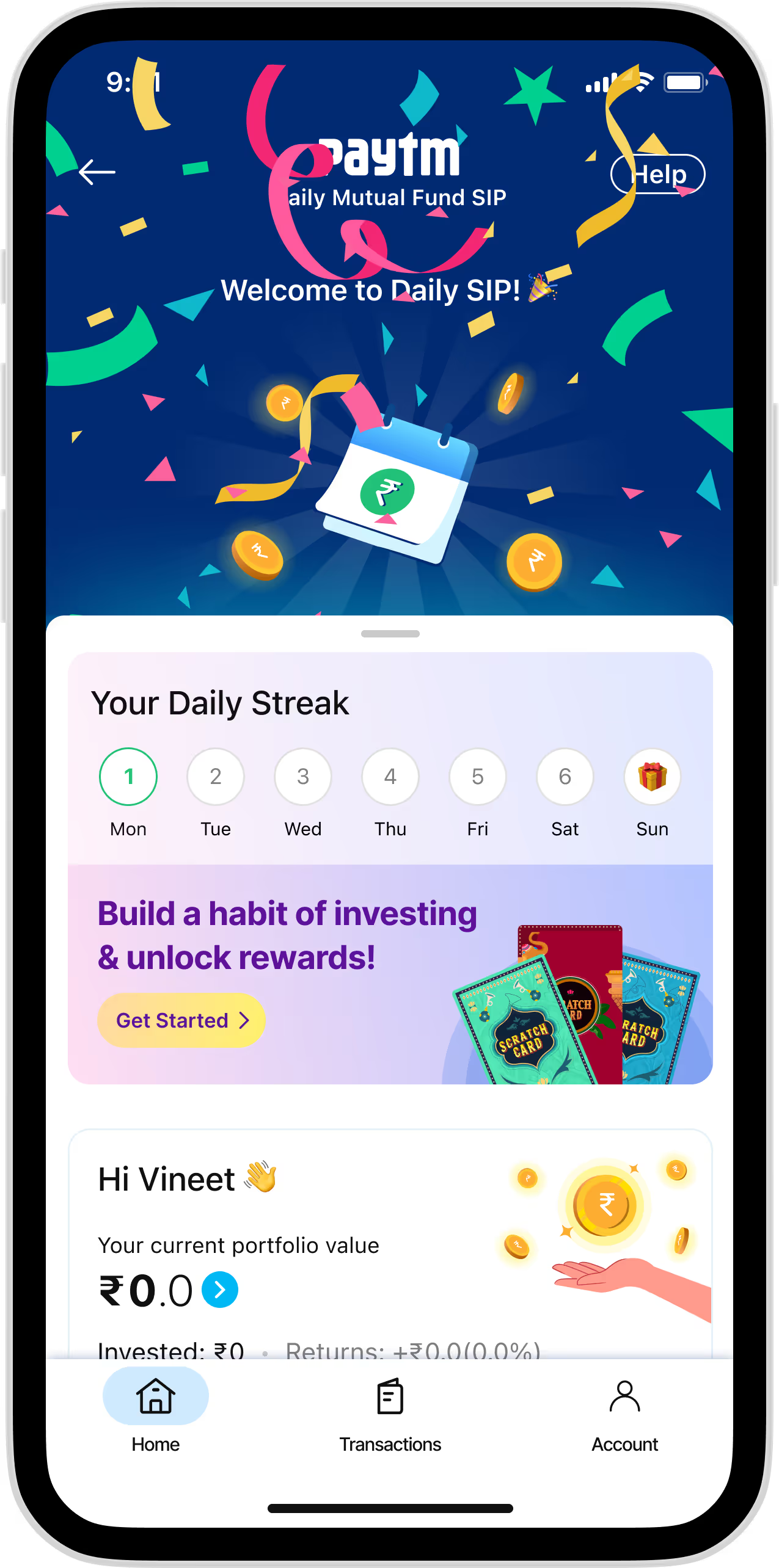
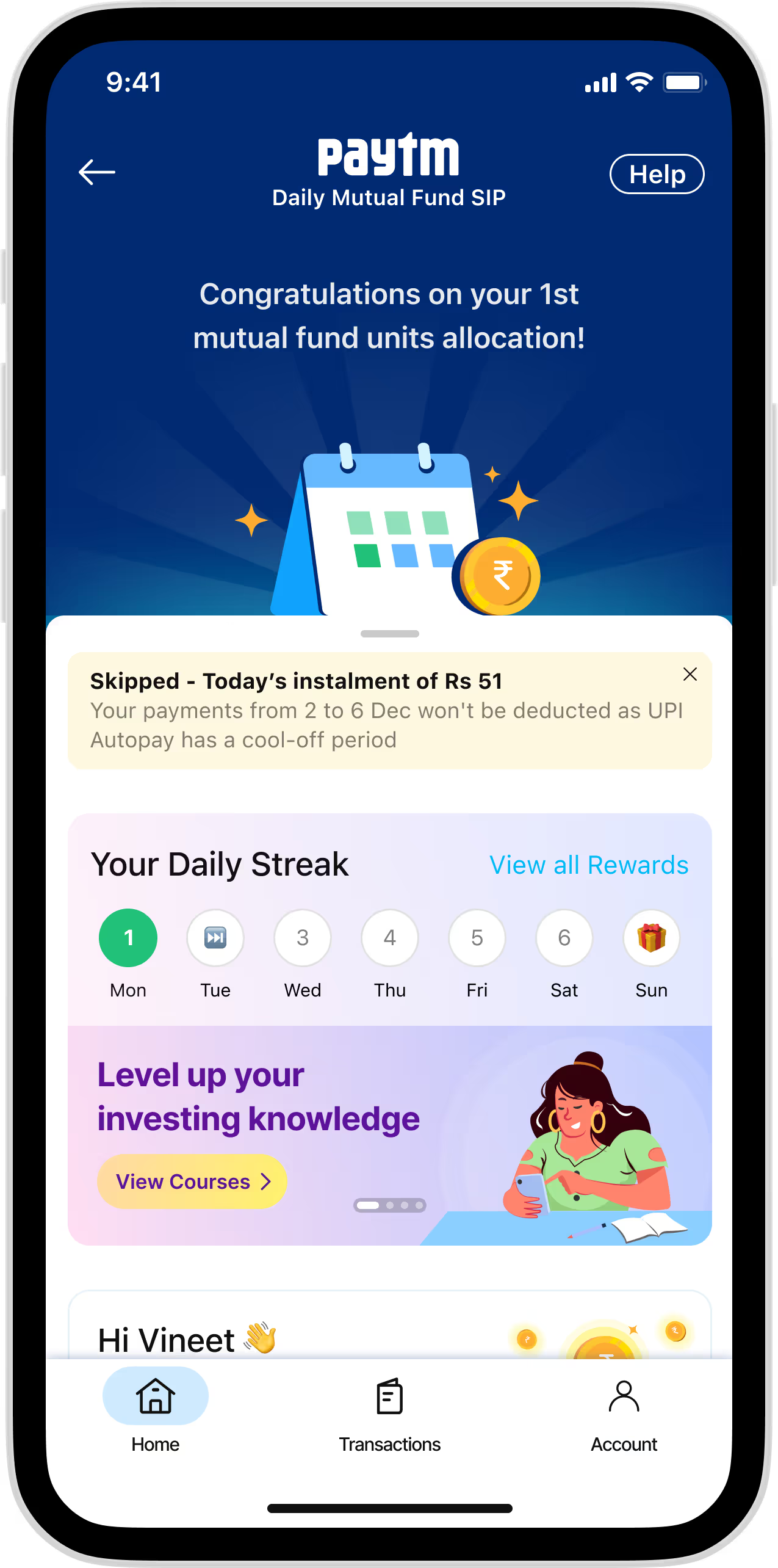
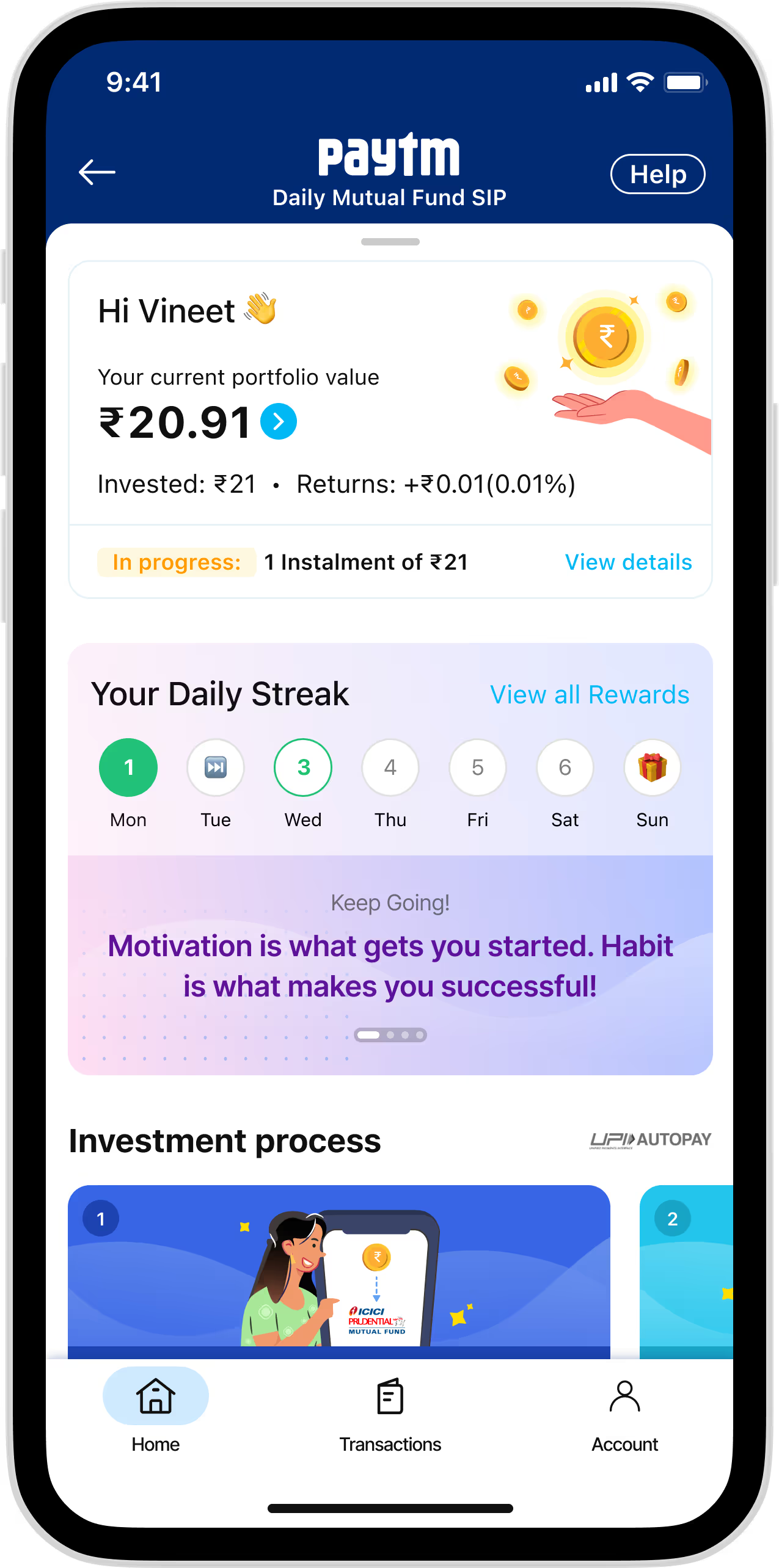
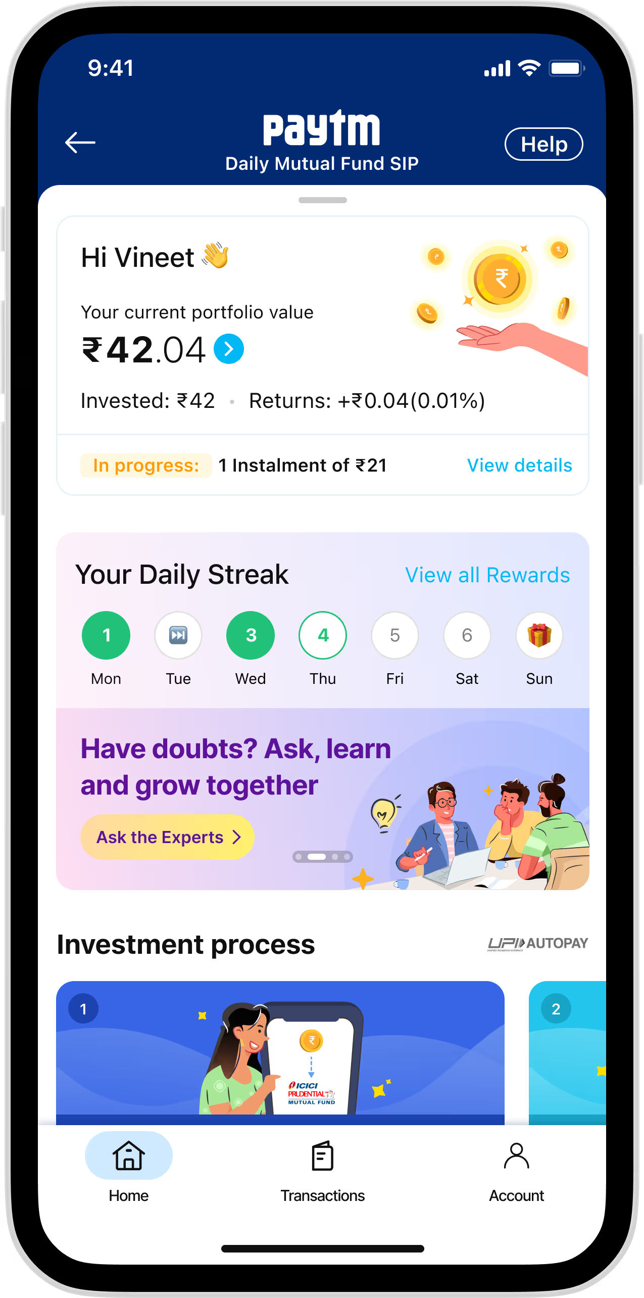
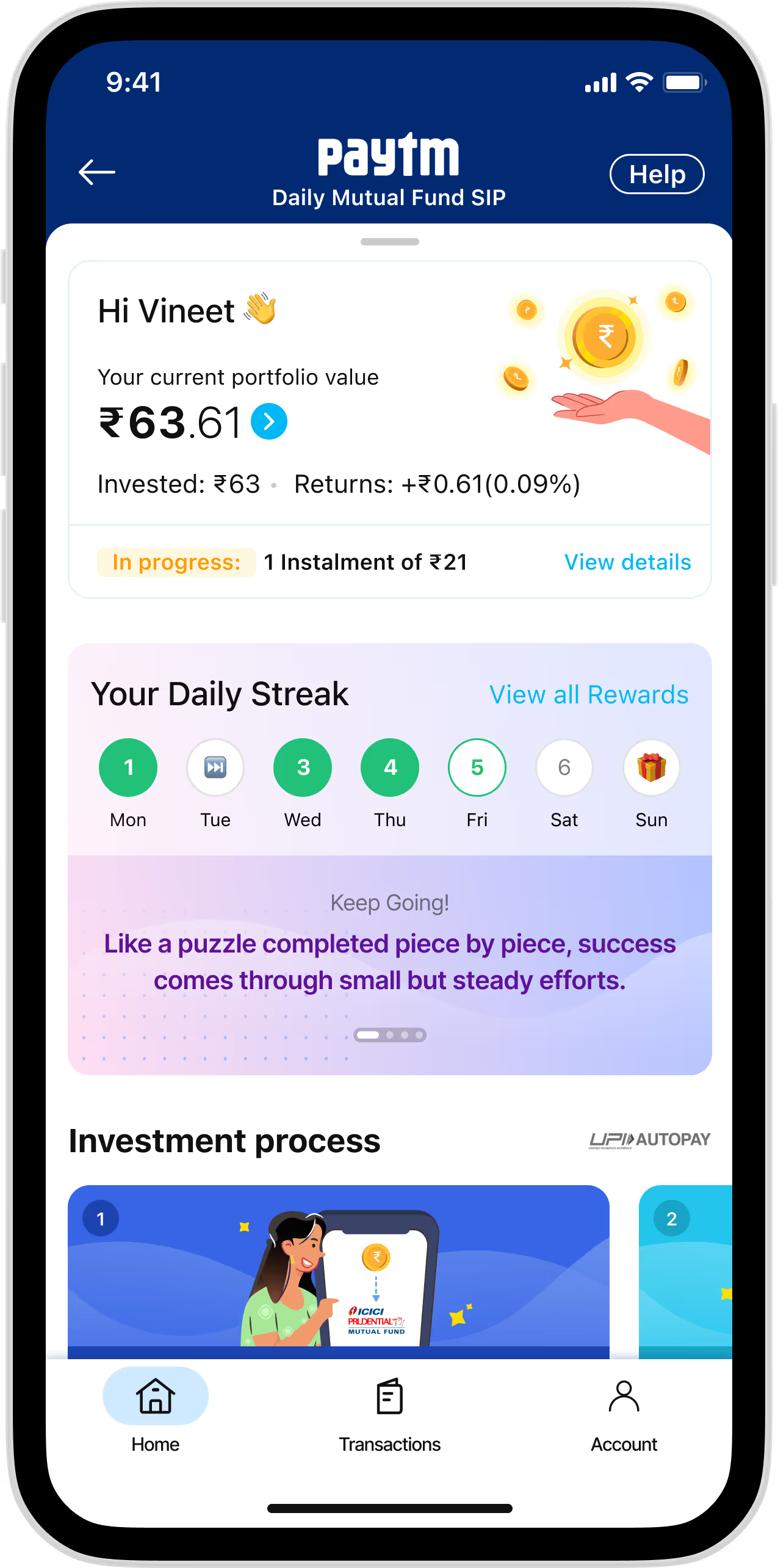
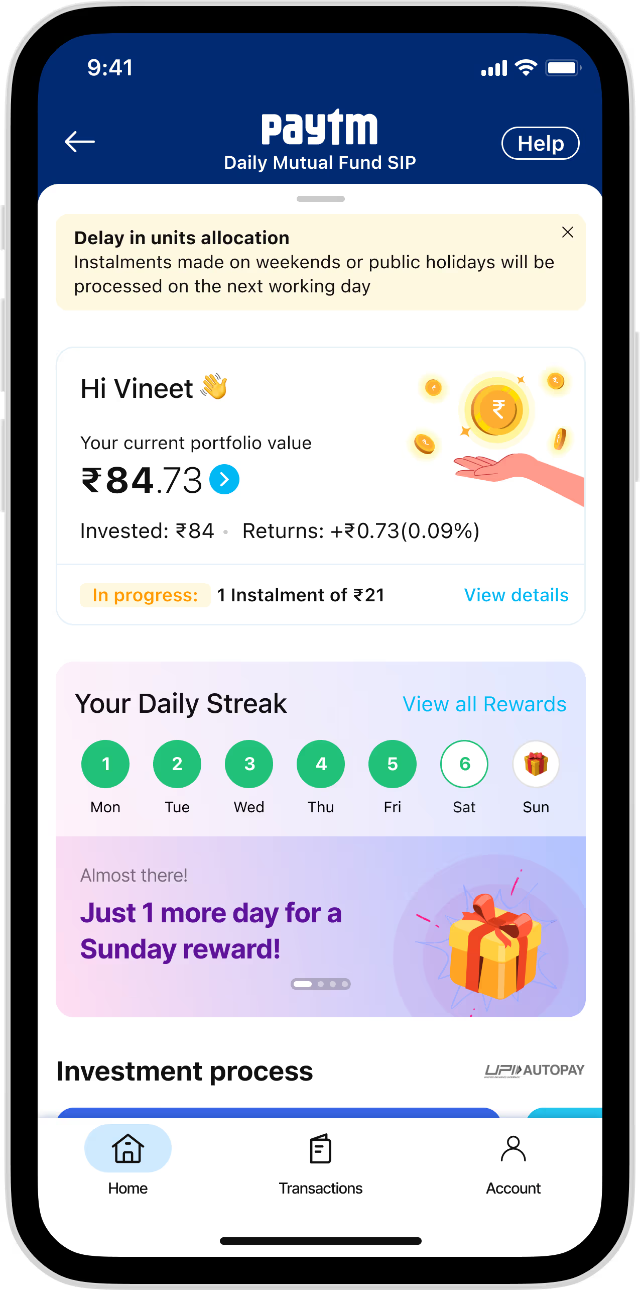
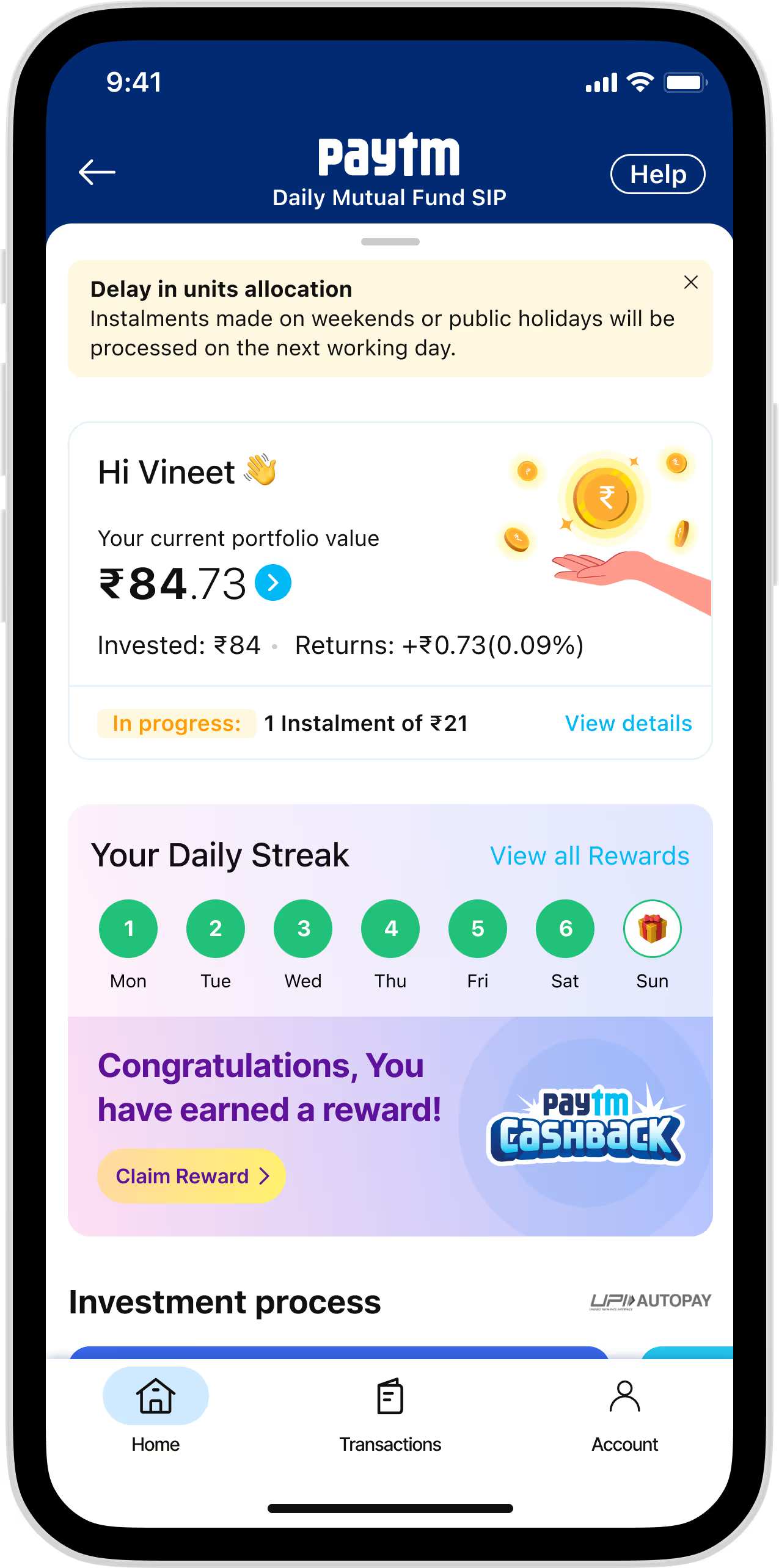
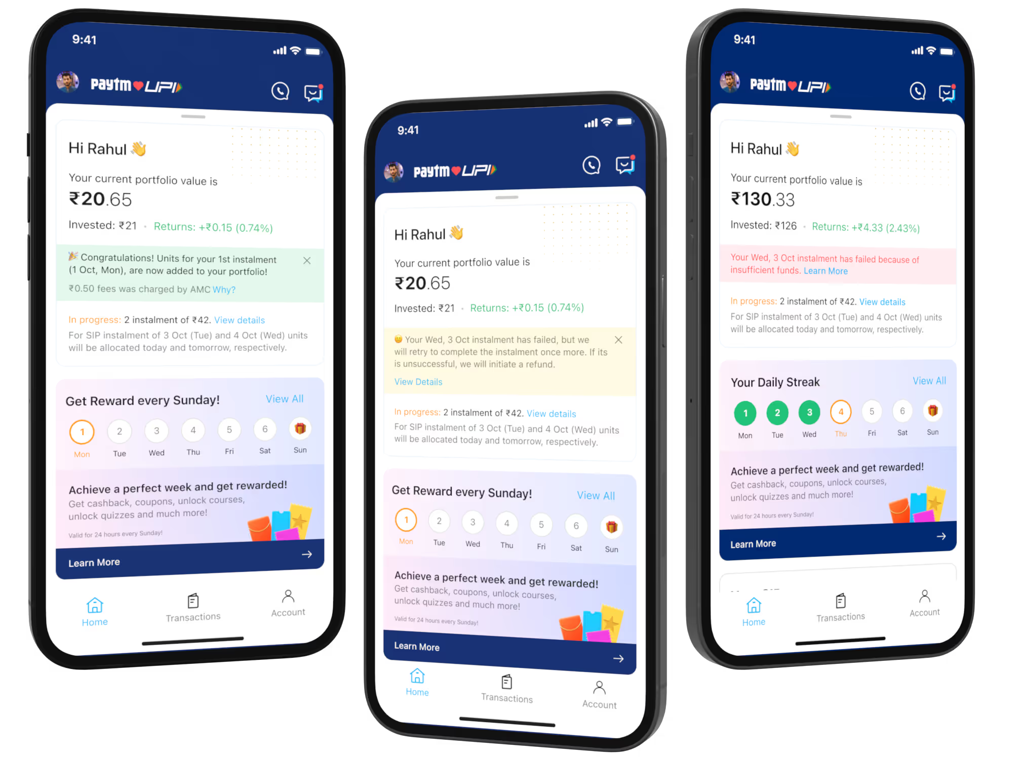
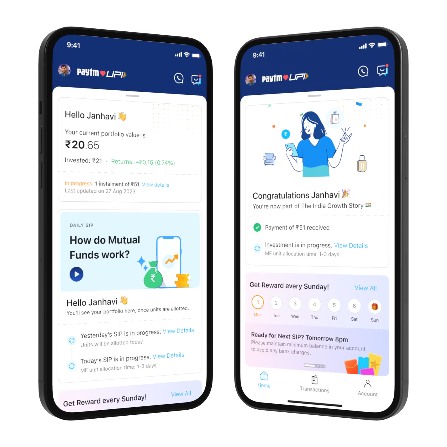
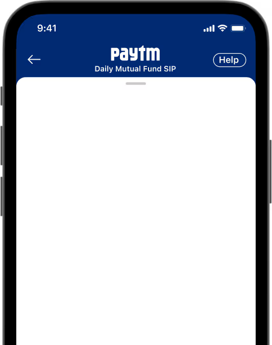
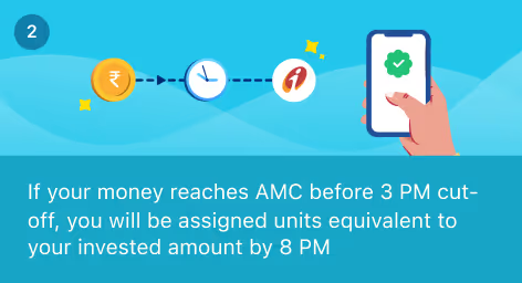
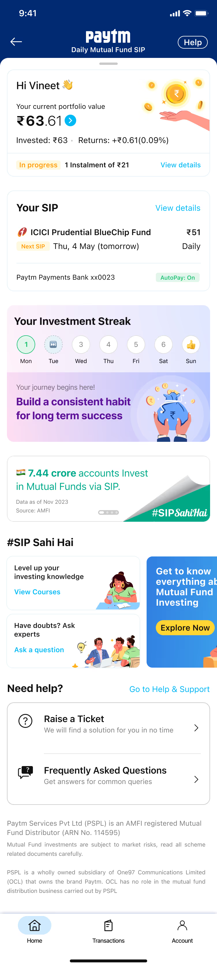
When users complete their account setup and authorize automatic payments through UPI, they're taken to their portfolio page where they can monitor their investments. We faced an interesting challenge: mutual fund transactions aren't instant like regular UPI payments, which could frustrate users. To keep them engaged during this waiting period, we created a 10-day educational journey with helpful information and contextual widgets. This approach helped prevent users from canceling their investments out of impatience and made sure they understood what was happening with their money during those early days.

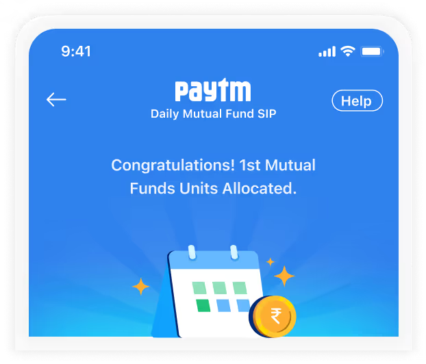
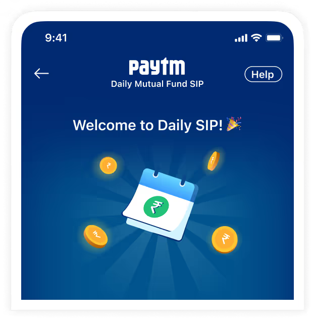
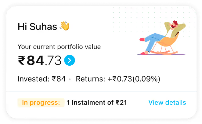


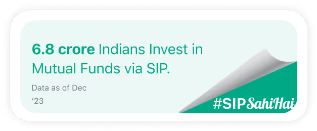




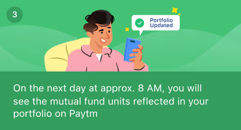
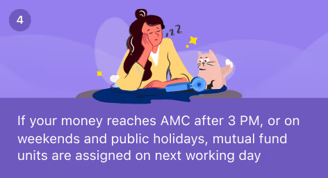
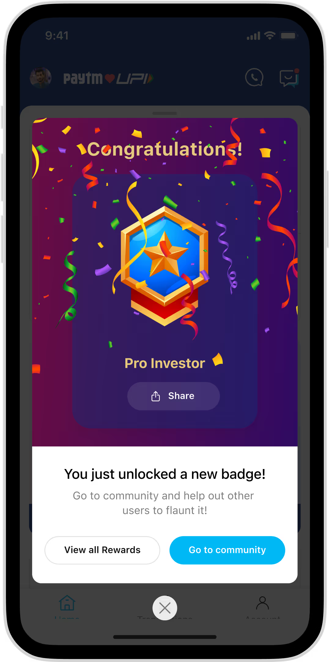
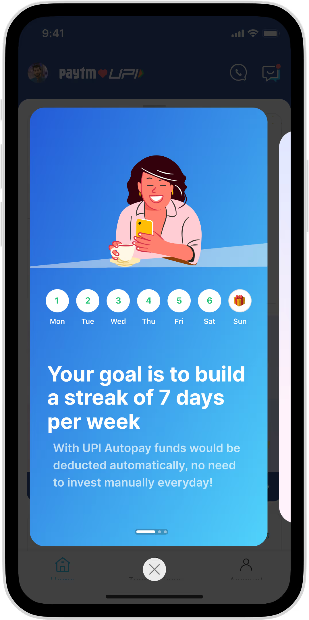
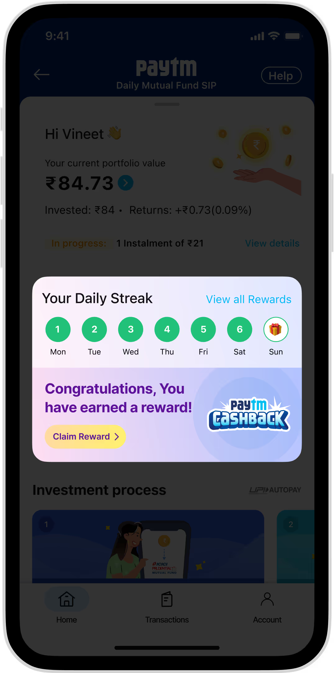
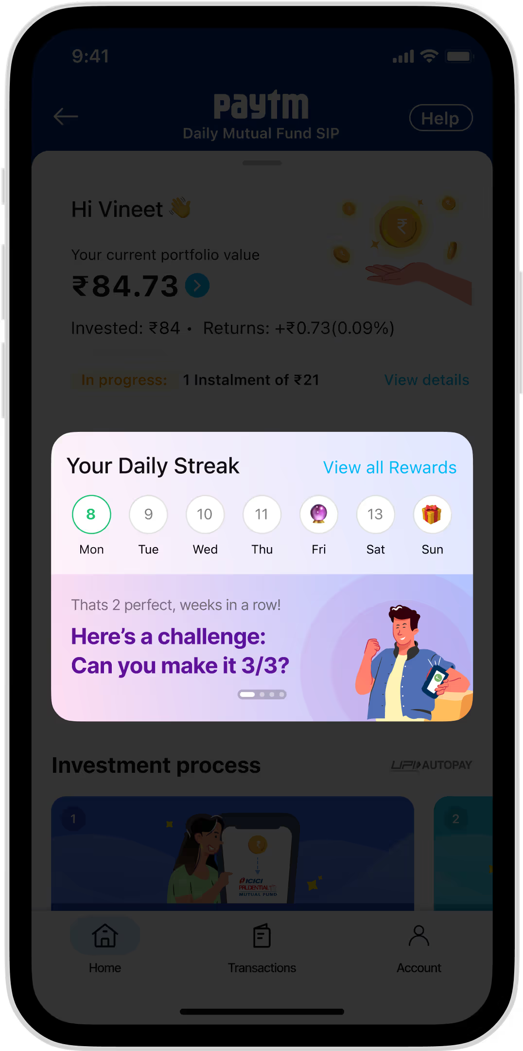
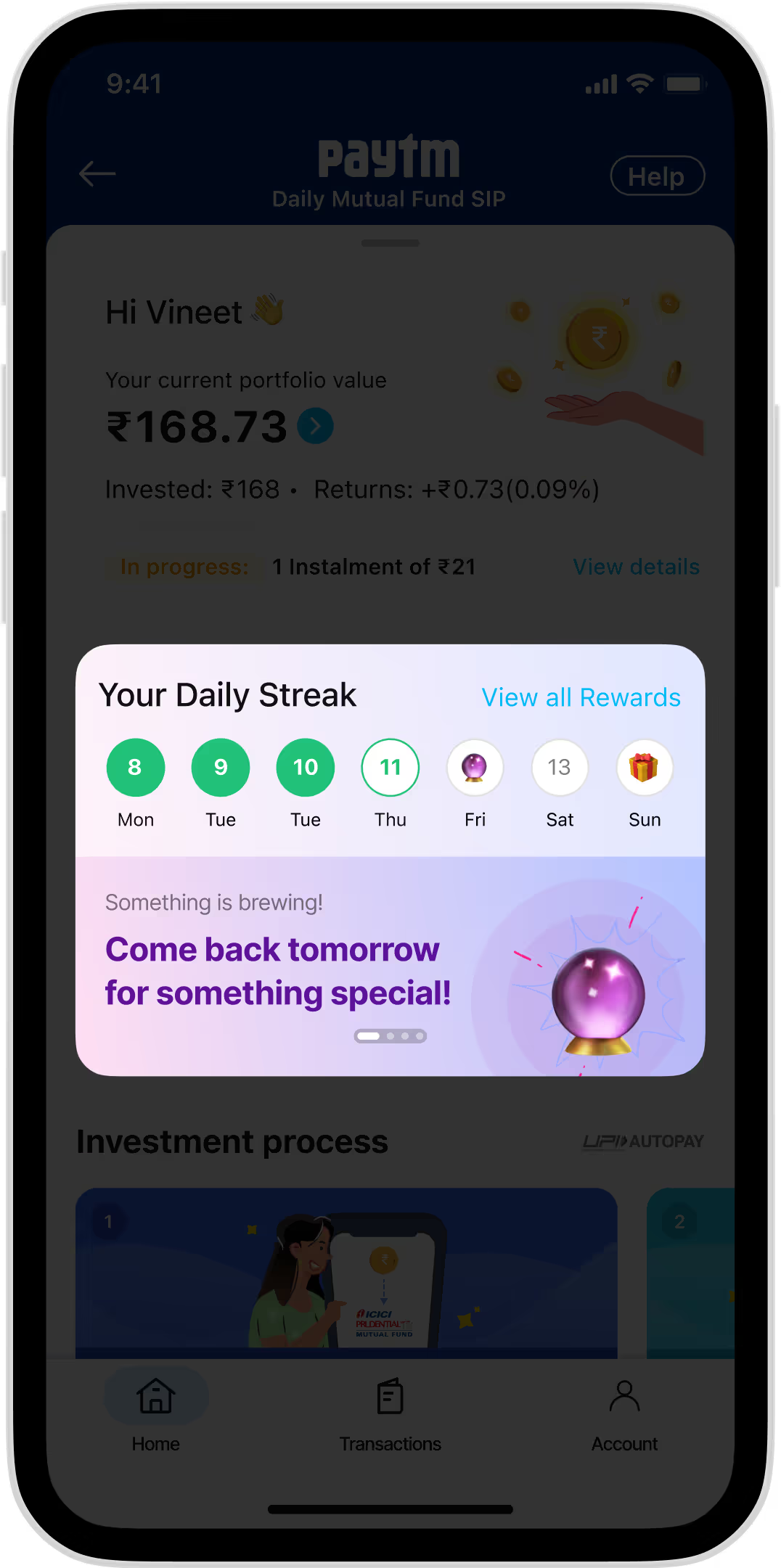
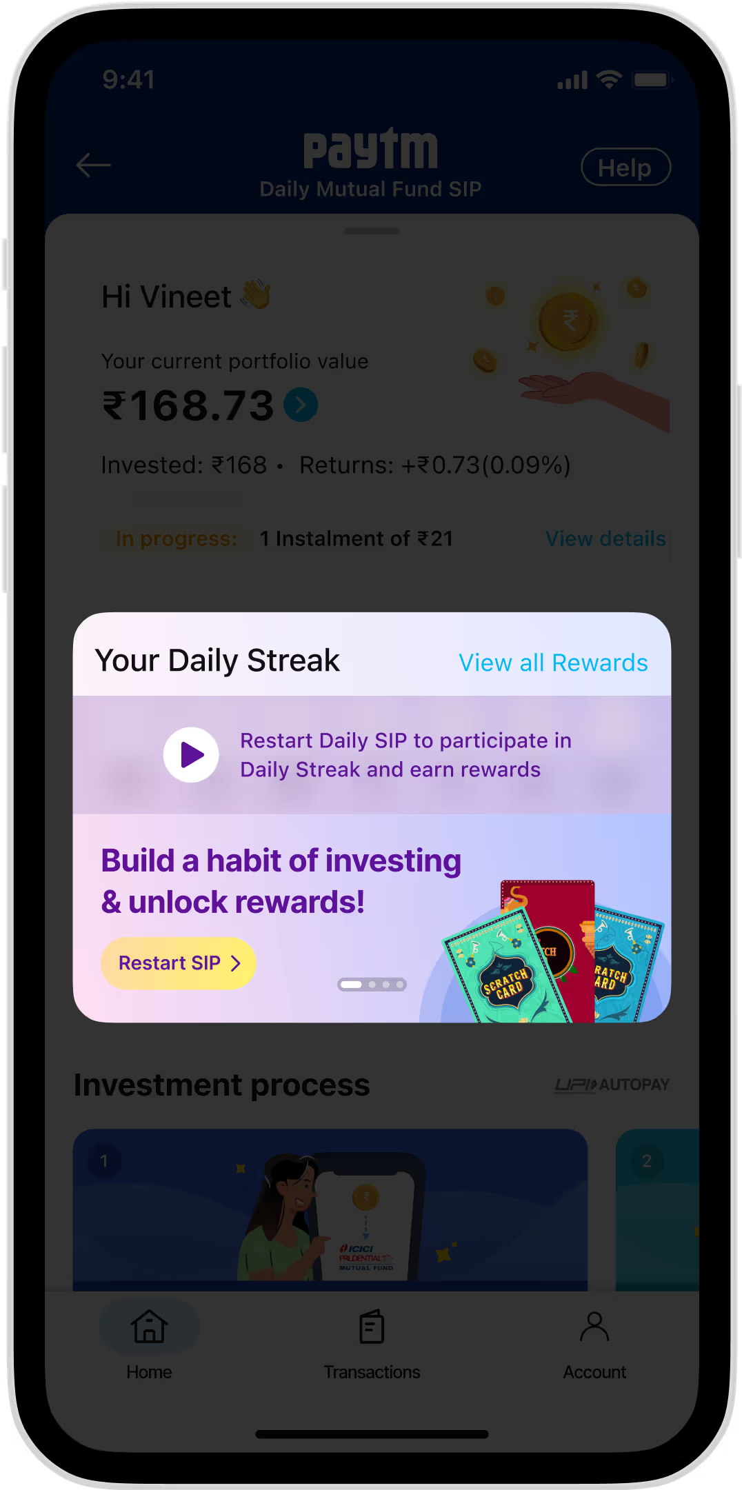
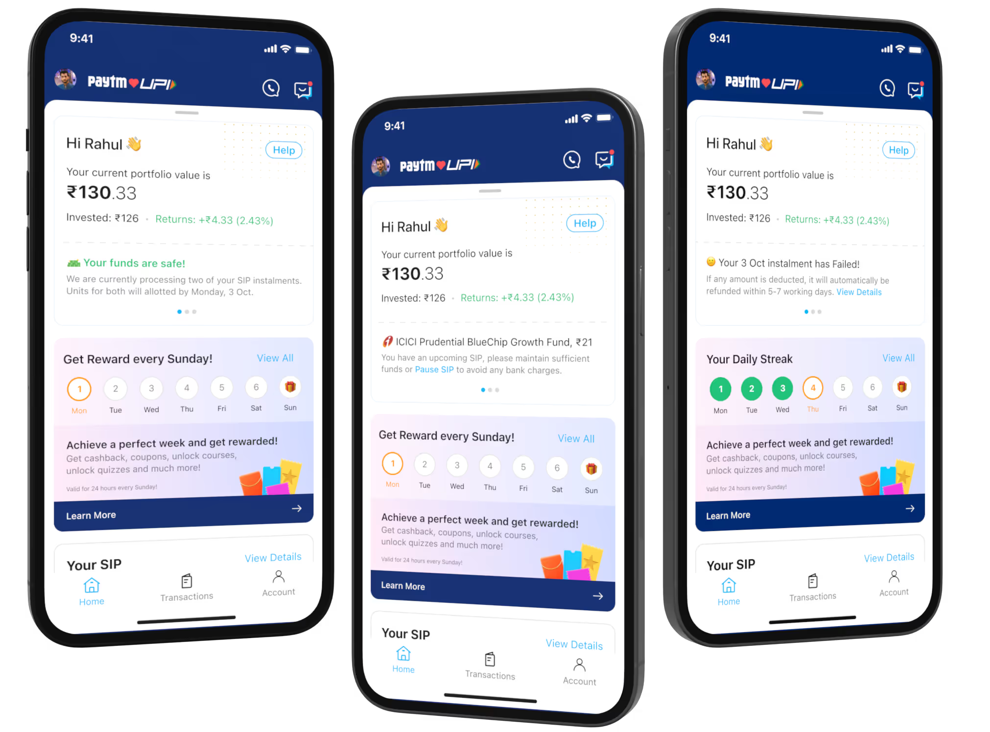
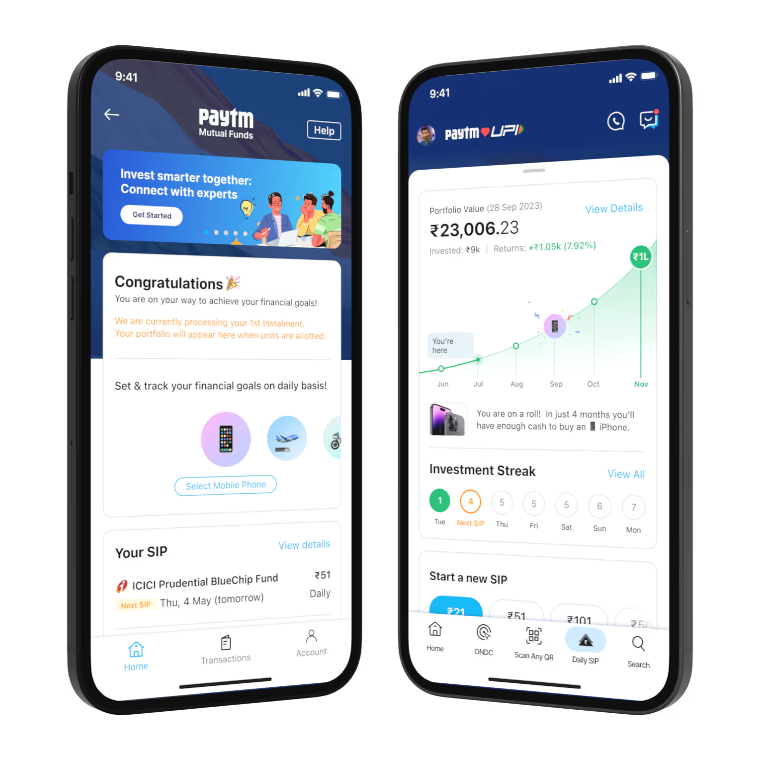
Unlike a typical streak feature that require active user participation, our streak would continue automatically as long as users kept enough money in their account for their daily investment. We used this streak system to both educate and reward users, adding fun elements to encourage consistent investing. The rewards were carefully planned to create a gentle FOMO effect - users wouldn't want to break their streak and miss out on the benefits that came from maintaining their investment routine.

The first version (MVP 1) of the product launched on November 2, 2024, for a group of existing Paytm users. Updates were made every two weeks through incremental sprints. After the initial release, the other designers moved to different projects, leaving only my manager, Dhanish (for one month), and me to work on Daily SIP. Eventually, I became the sole designer leading the product. During this time, we onboarded growth managers and the CS team. I worked closely with the growth managers to test campaign ideas and with the CS team to gather customer feedback, focusing on onboarding and cancellation processes.


Daily SIP became my favorite project because of the team’s deep focus on data—both quantitative and qualitative. Our tech lead set up a cron job to share funnel data every hour in our WhatsApp group, allowing the team to monitor, question, and suggest improvements. We also had a dedicated 45-minute daily stand-up, where CS leads shared insights from outbound and inbound calls. Additionally, we closely monitored Redash dashboards and specific event data to understand user behavior and preferences.
Our focus on data drove us to continuously experiment with different designs, running multiple tests to discover what worked best for Daily SIP users. These experiments were informed by insights from the CS team, benchmarks of similar products, quantitative data, and my expertise in product design and UI/UX. We tested key elements such as the landing page, onboarding process, autopay mandate creation, post-investment journey, and SIP cancellation.
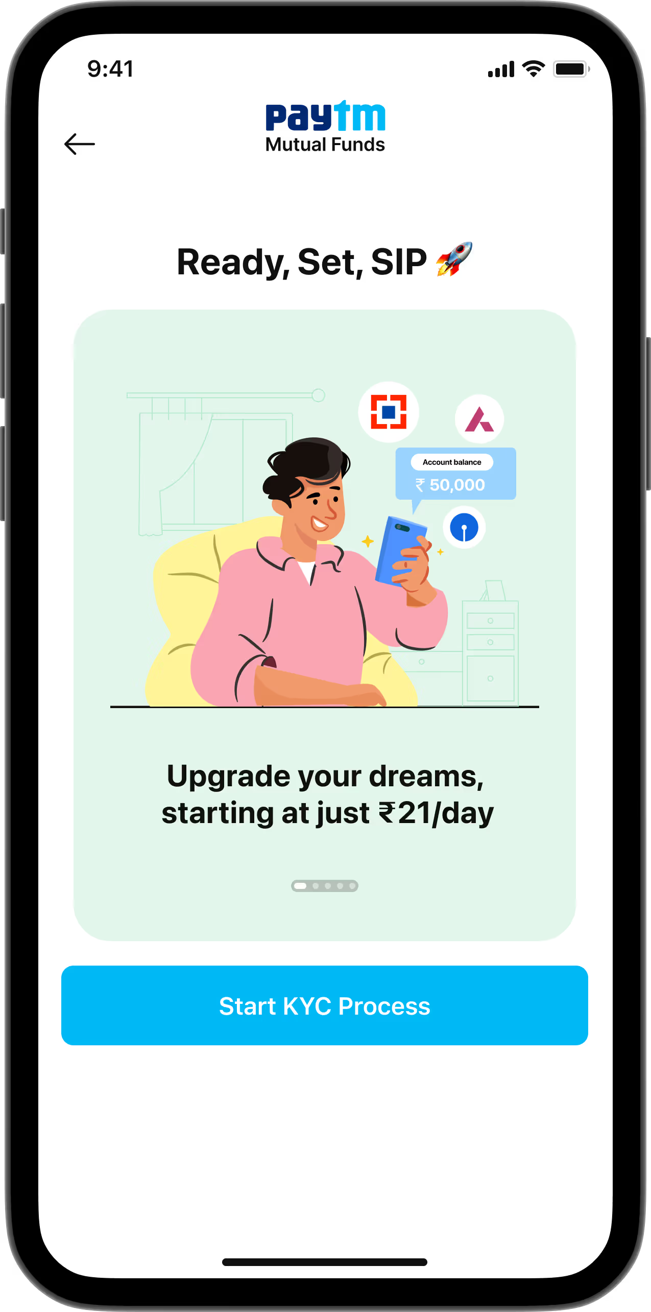
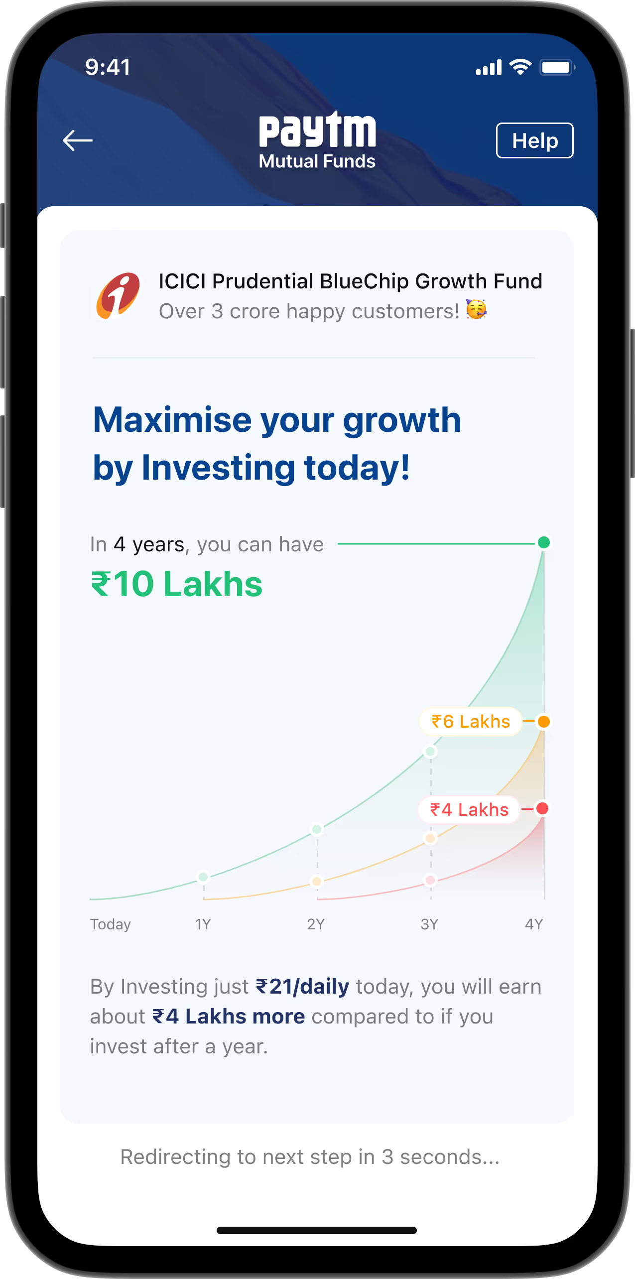
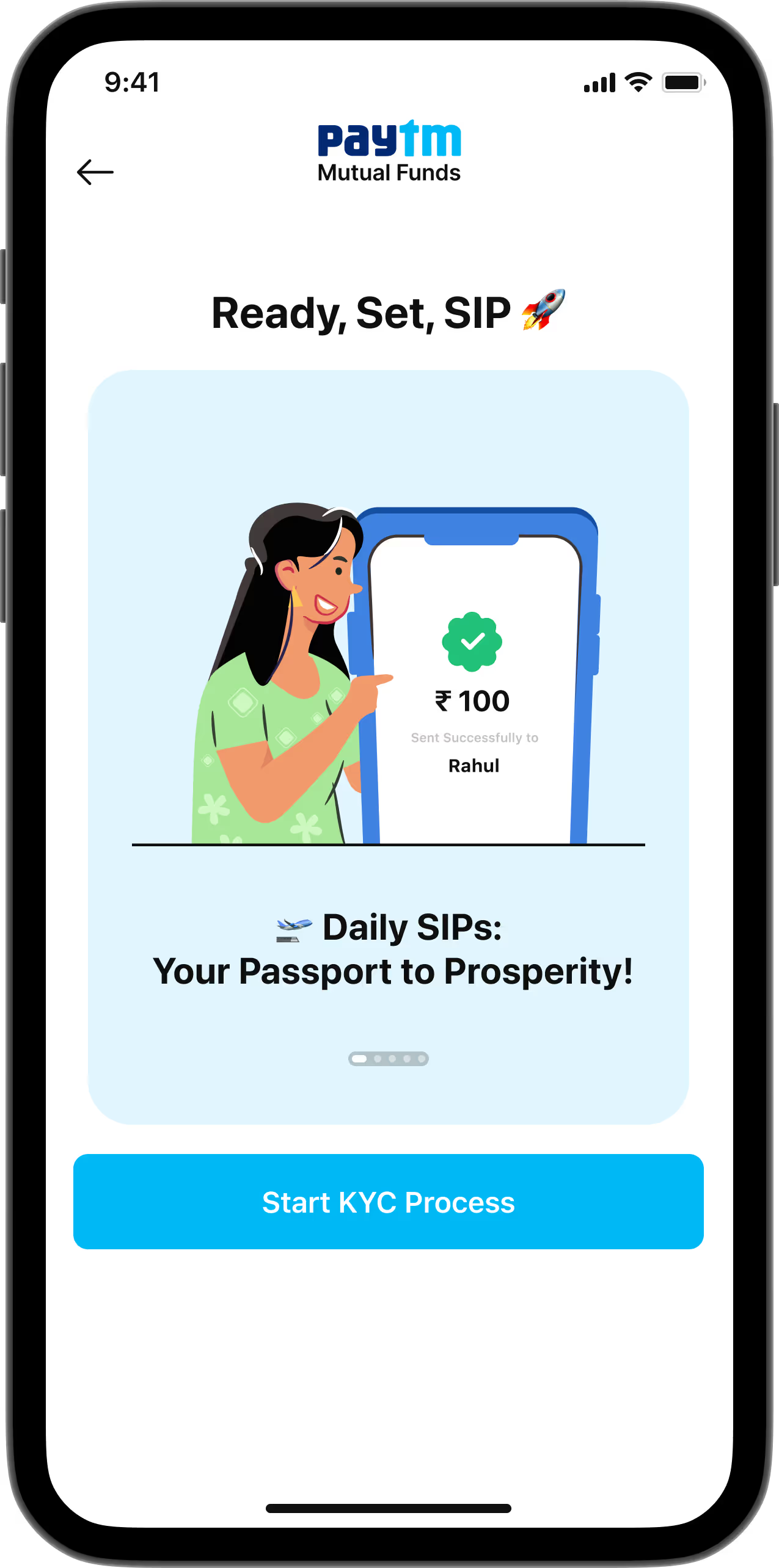
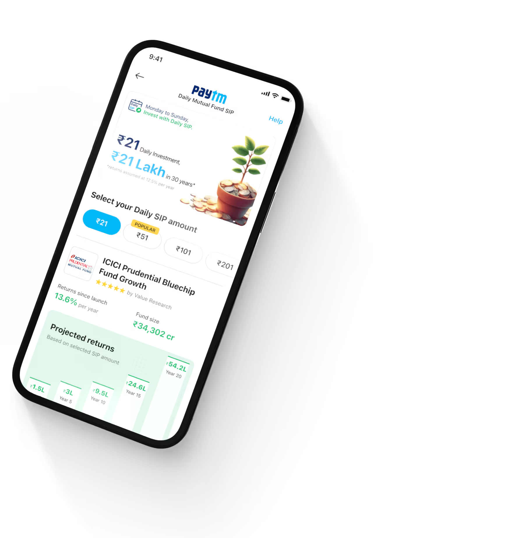
The landing page is a crucial part of any product. We identified two primary user personas: first-time mutual fund investors and experienced investors. For first-timers, we focused on clearly explaining the product’s benefits. For experienced investors, we emphasized how our mutual fund products stood out from their previous investments. Our goal was to make the landing page simple, intuitive, and optimized for quick investments. By running multiple A/B tests, we successfully increased the conversion rate from 18% to 28%, driving more users to begin their onboarding journey.
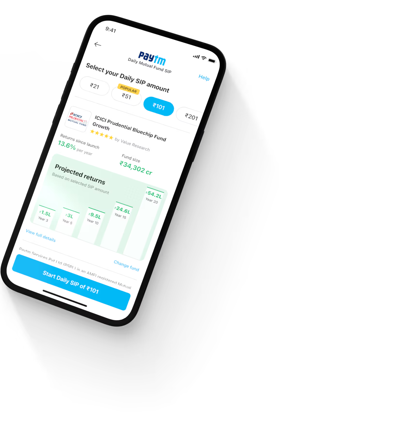
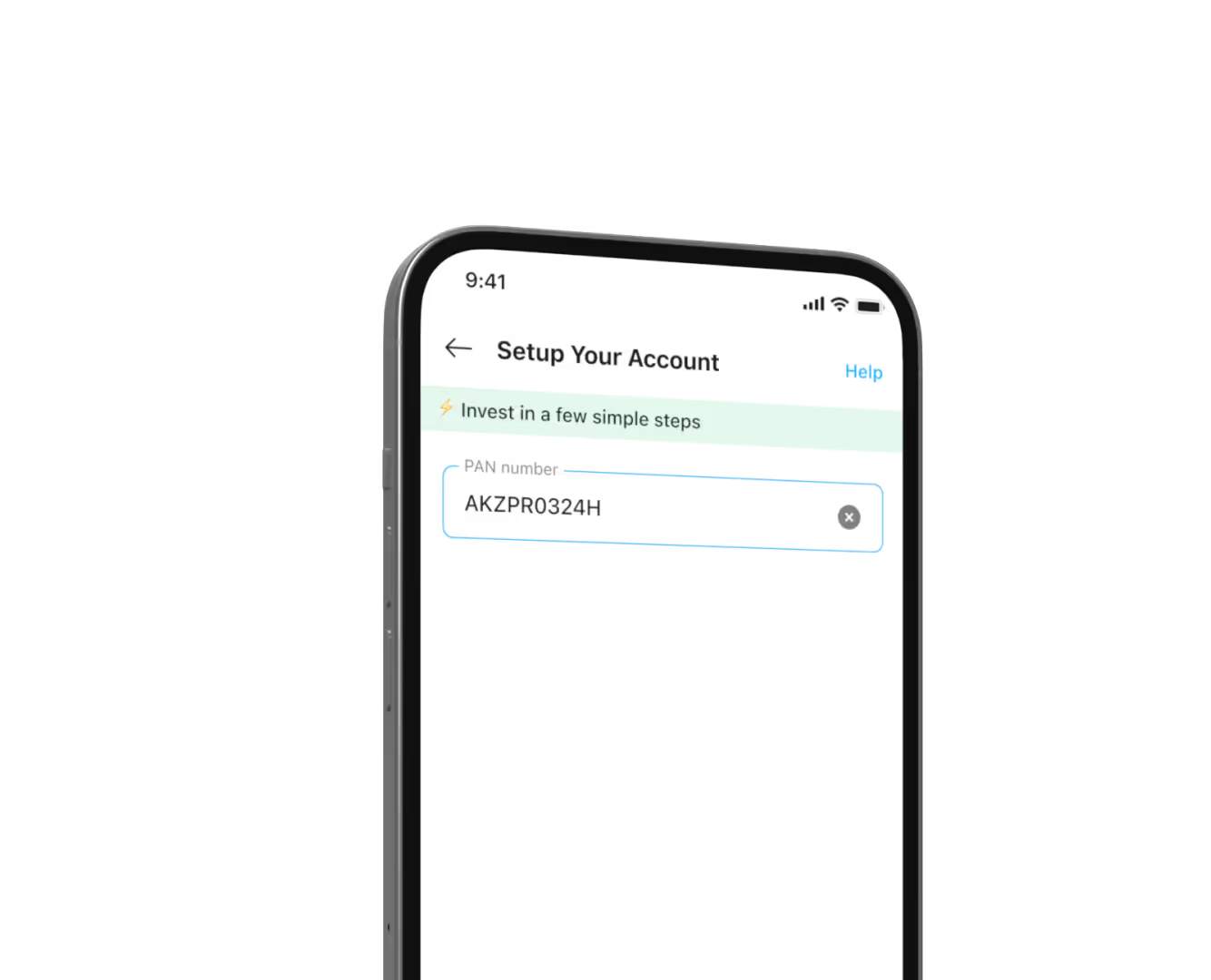
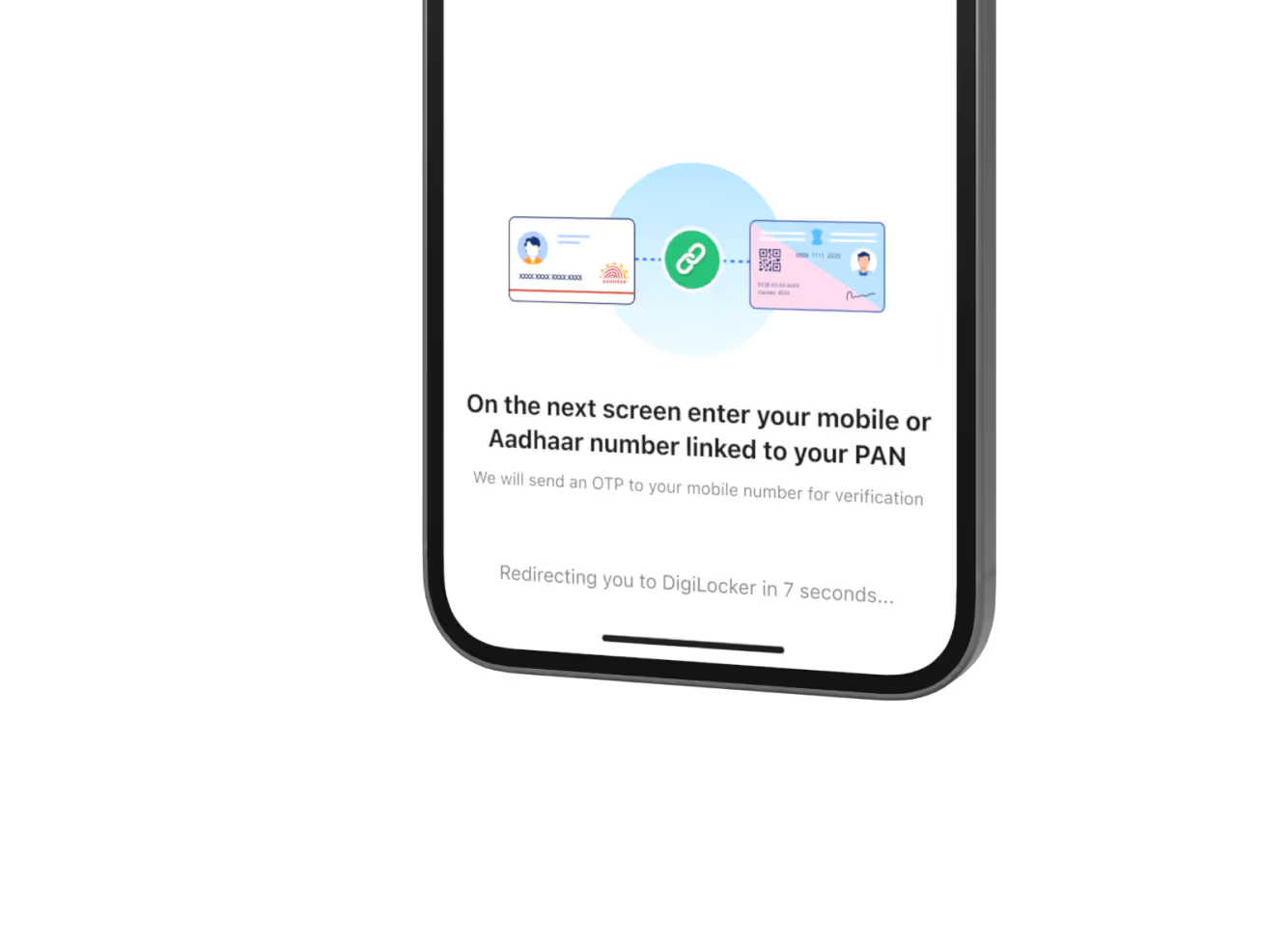
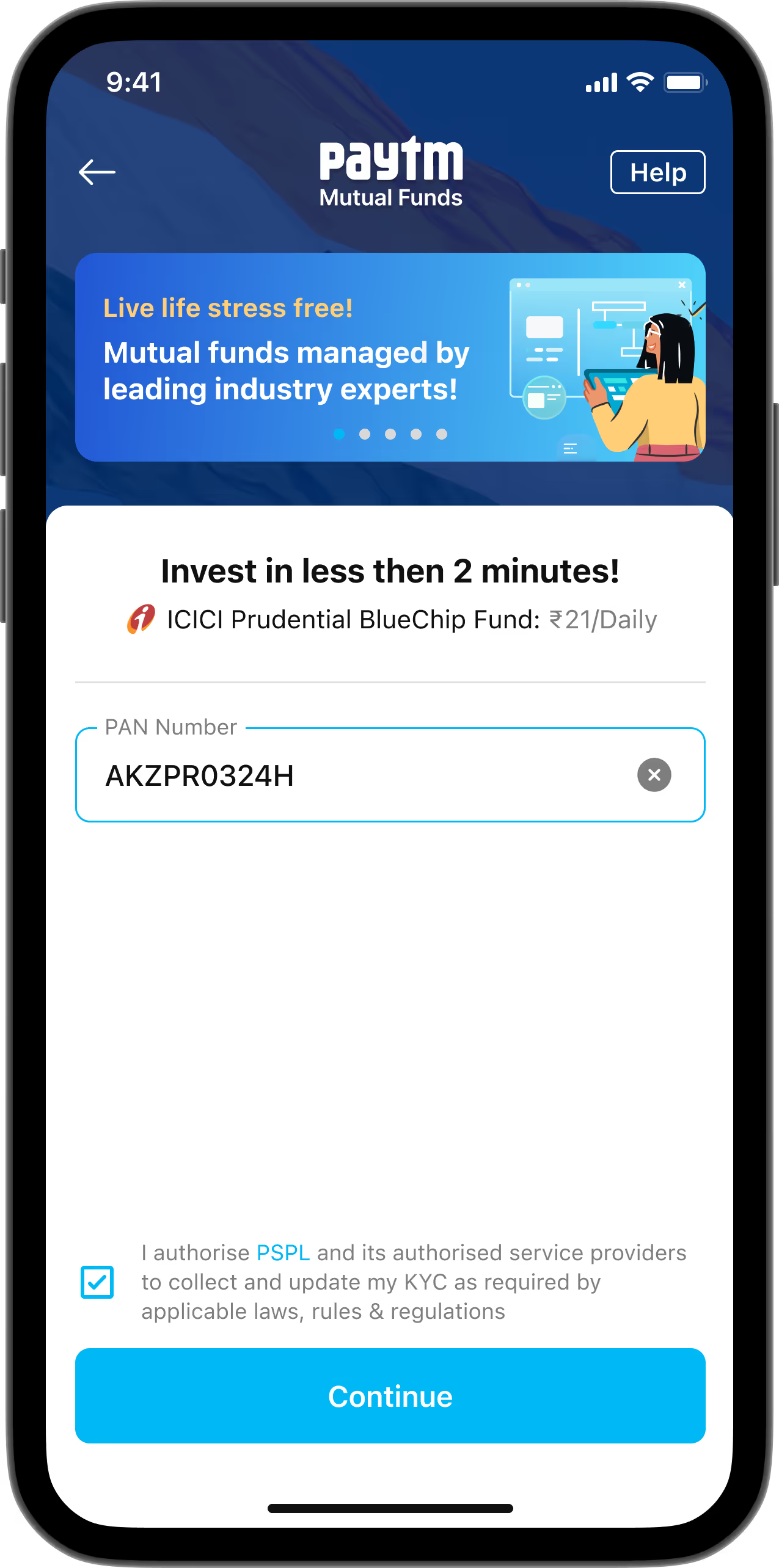
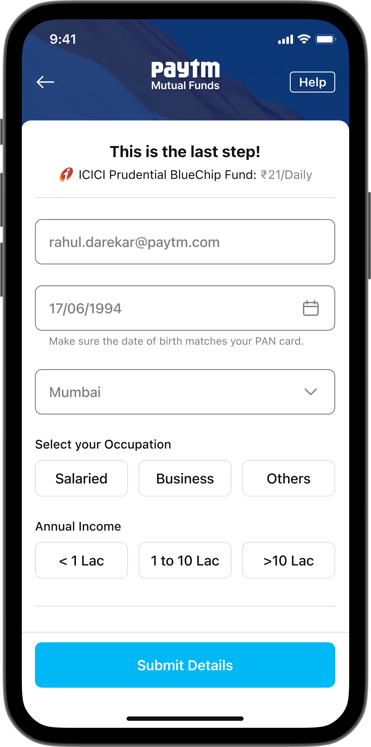
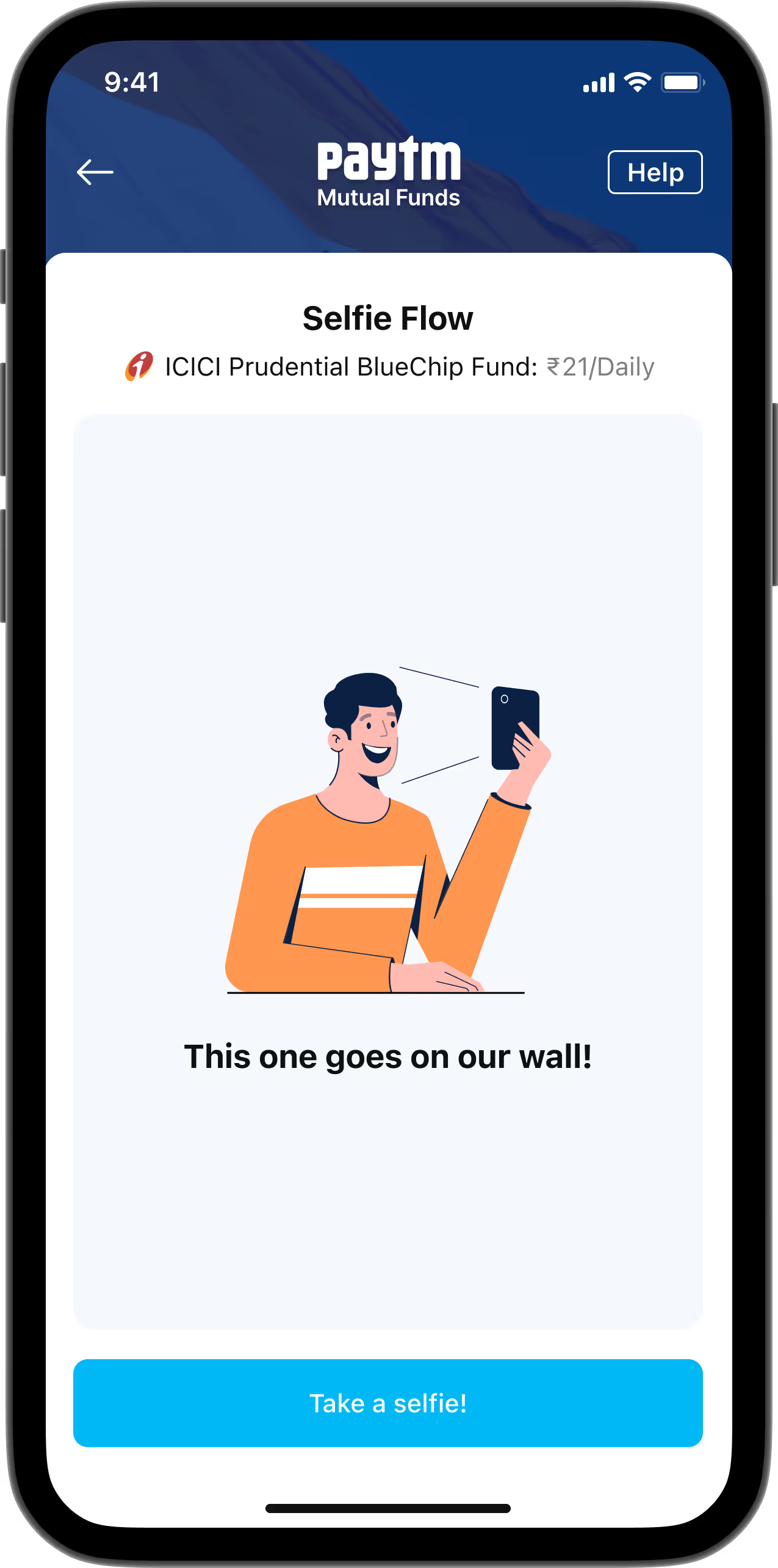
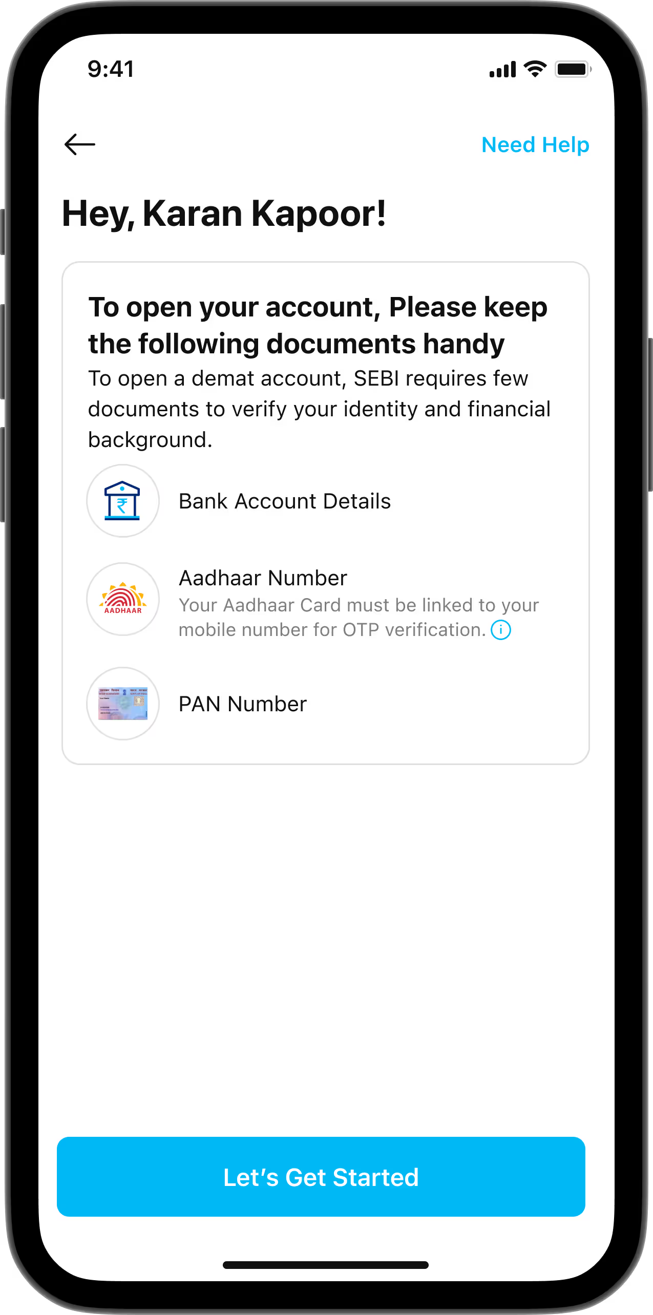
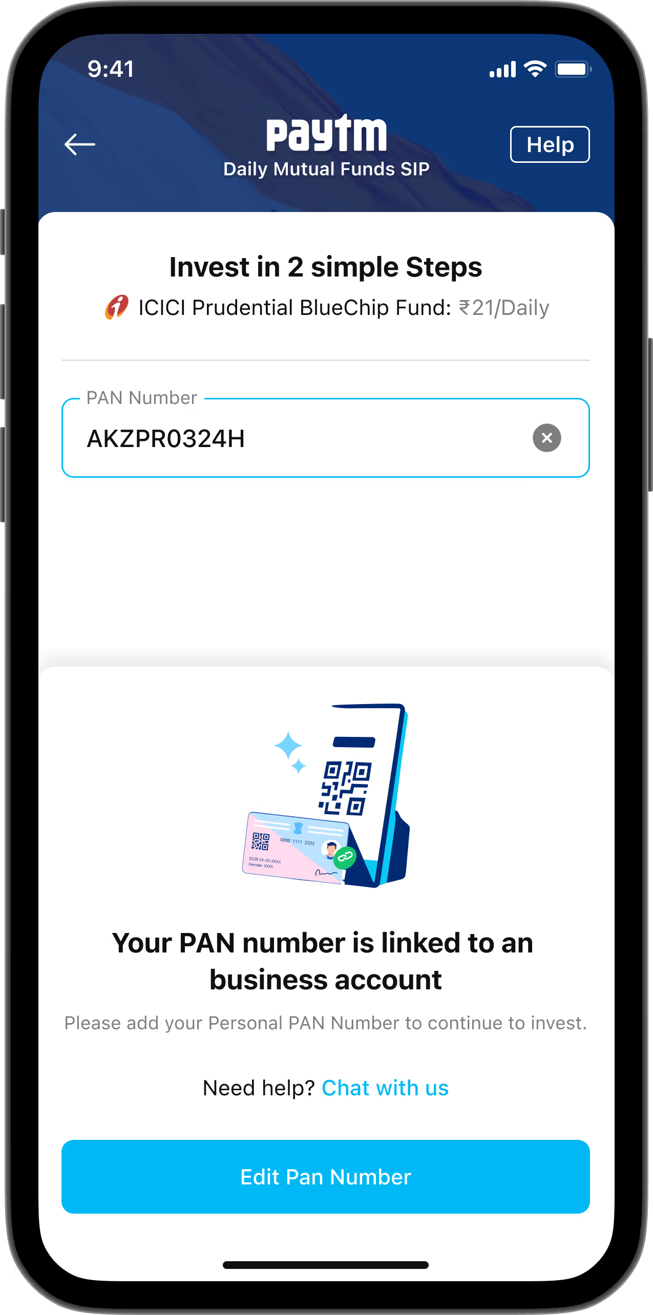
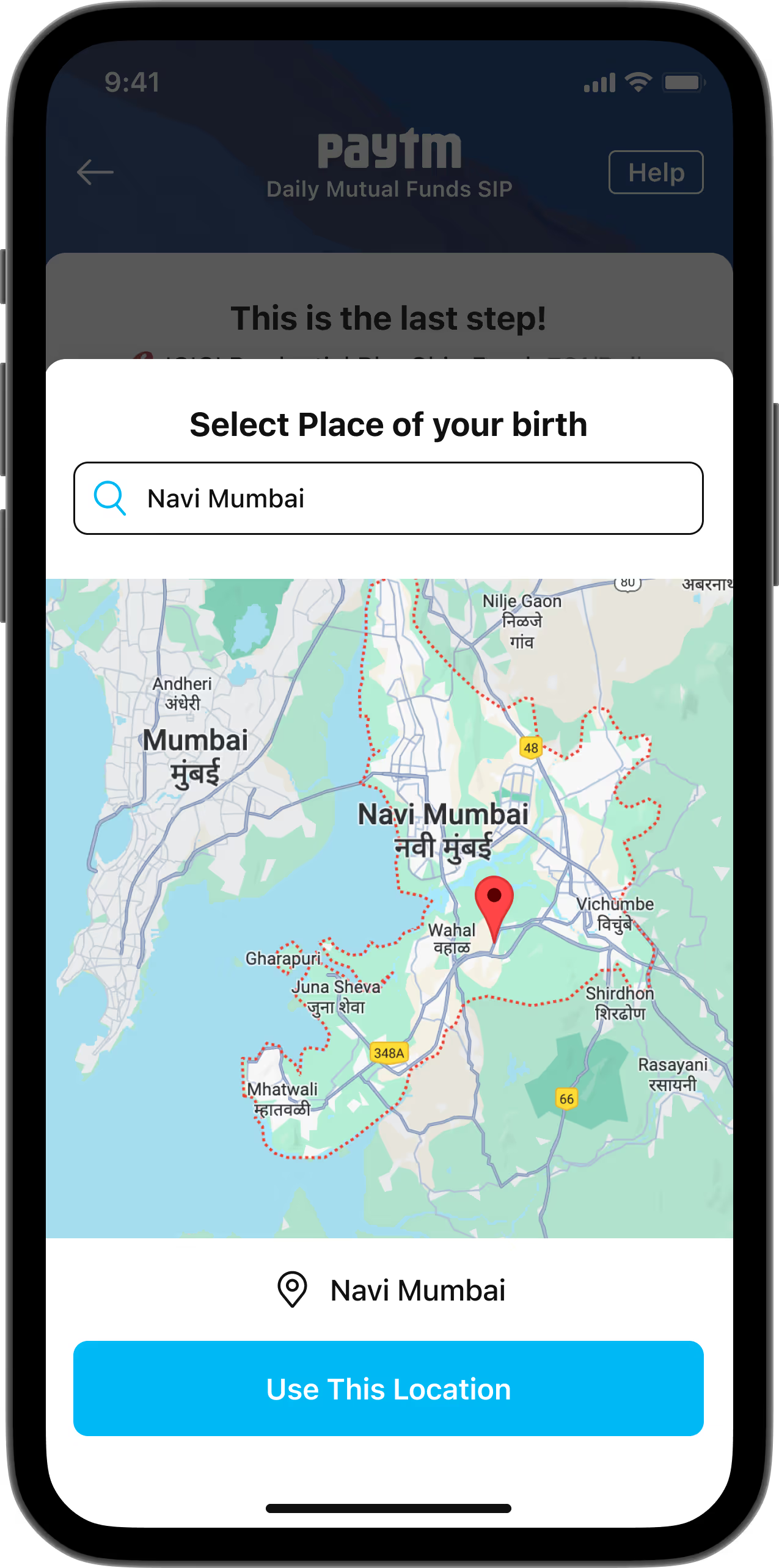
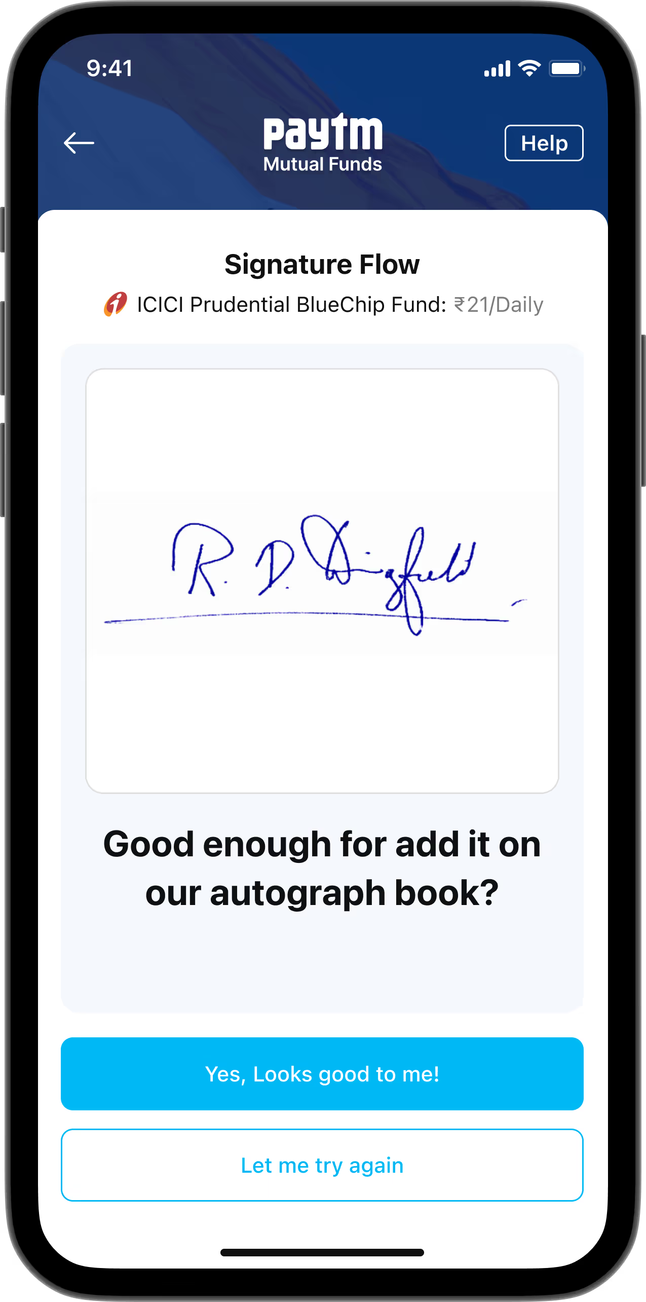
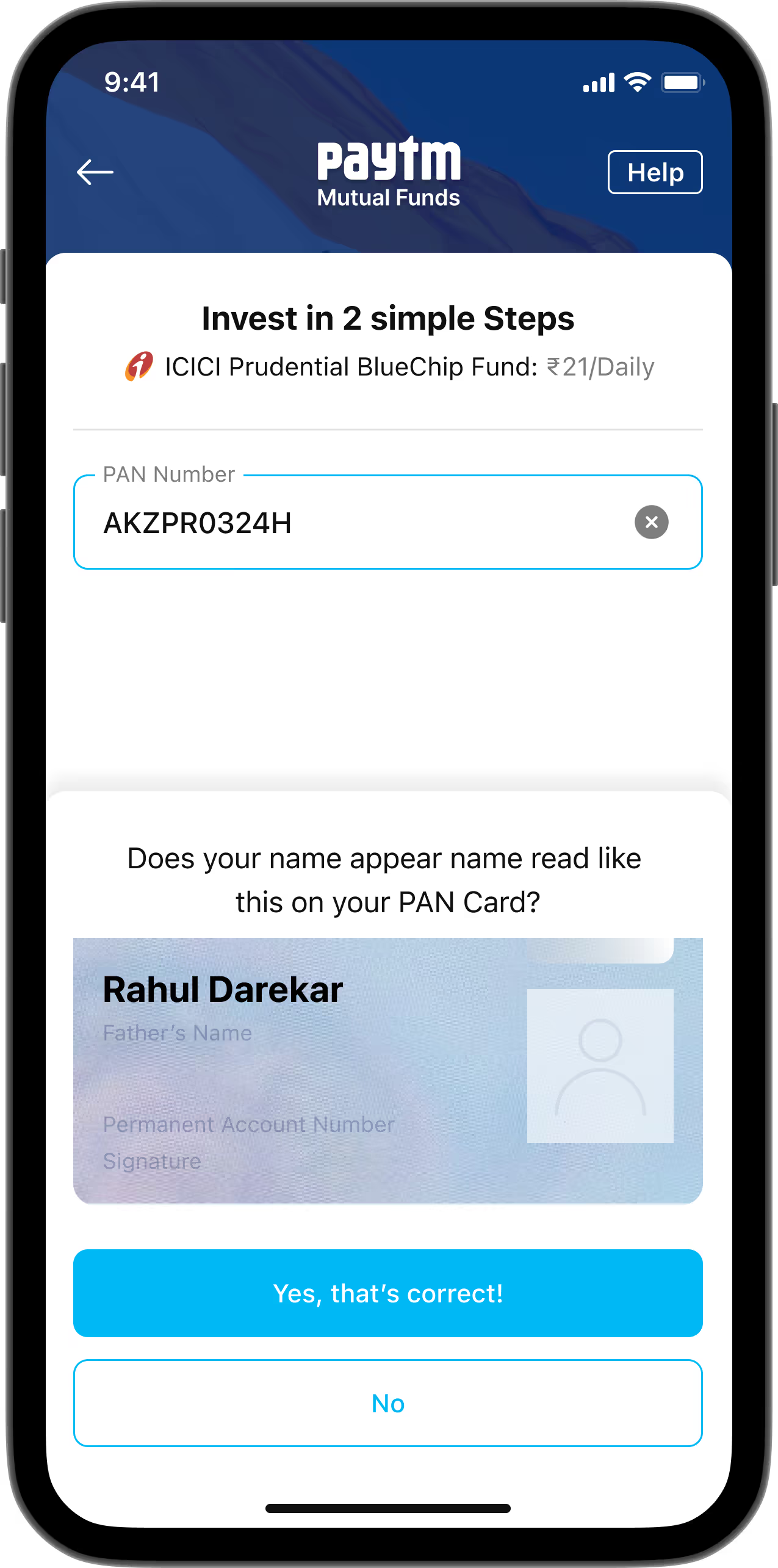
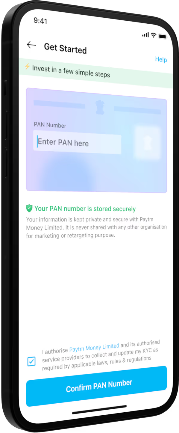
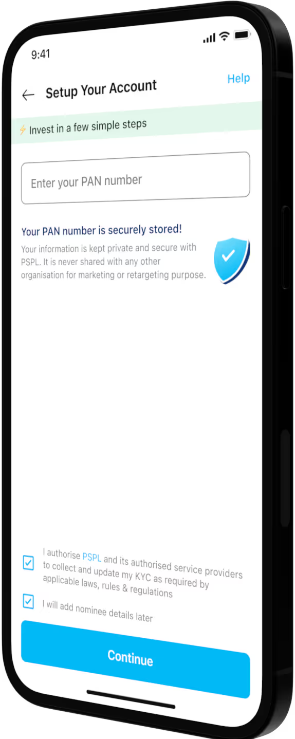
Onboarding can be a complex process, often leading to user drop-offs due to its multi-step nature. The first step requires entering a PAN number, commonly used for tax filing or bank account setup. Non-KRA users also need to provide Aadhaar details and register with Digilocker (a government portal for storing official documents). Additionally, both the Digilocker and eSignature steps redirect users to external websites. By testing several iterations of the non-KRA flow, we improved the conversion rate from PAN entry to final investment from 3.0% to 3.8%, achieving a 26% increase.
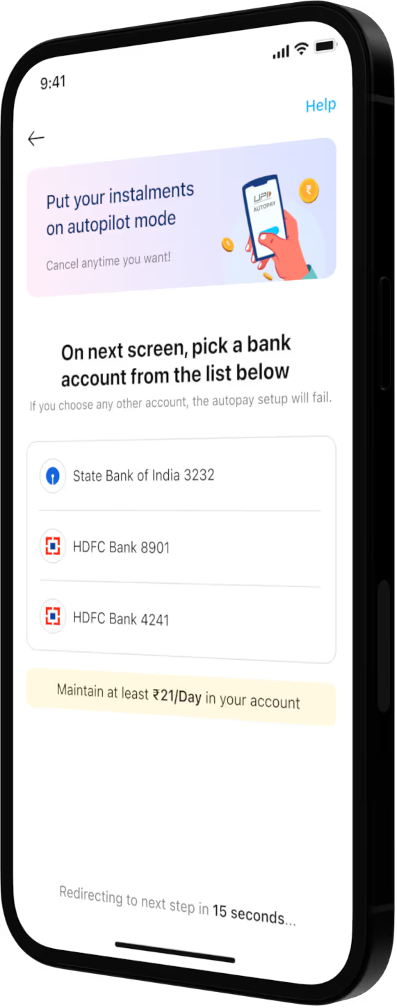
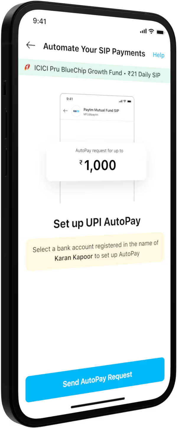
Setting up an autopay mandate is a critical step as it requires users to commit to recurring payments, often leading to hesitation. KRA users (with demat accounts) set up mandates through their registered banks, while non-KRA users must ensure their PAN name matches their bank account for UPI autopay. Initially, the mandate setup page featured educational content and a preview of the mandate request in the Paytm app, achieving a 50% conversion rate. To boost this, we replaced the preview with a banner highlighting temporarily disabled banks and implemented auto-redirection to the app for mandate setup. However, this auto-redirection reduced the conversion rate, disproving our hypothesis.
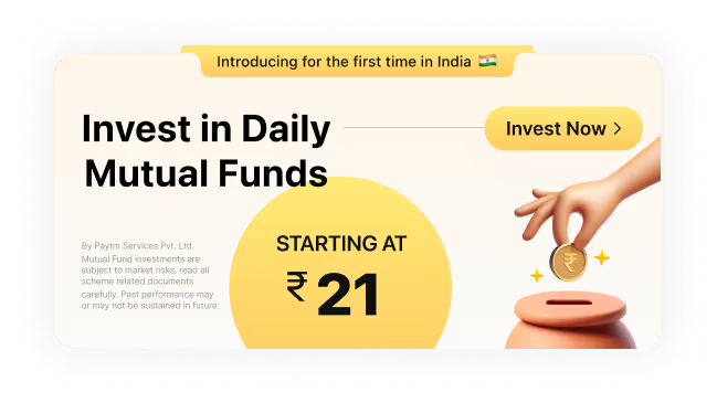
At launch, we didn’t have a dedicated marketing team, so the design team took charge of brainstorming and executing campaign ideas. One of the early campaigns was "₹21 se ₹21 Lakh," meaning "from ₹21 to ₹21 Lakh (₹21,00,000)." This slogan was memorable, unique, and clearly communicated the product’s potential: investing ₹21 could grow to ₹21 Lakh. Other campaigns featured simple, actionable messages like "Invest in Daily SIP, starting at ₹21" and "Retire with ₹1 Crore," leveraging insights that large numbers drive better click-through rates. We also launched festival-themed campaigns and A/B tested multiple banner designs across off-deck and on-deck placements. Additionally, we tested static and animated icons within the Paytm app to enhance engagement.






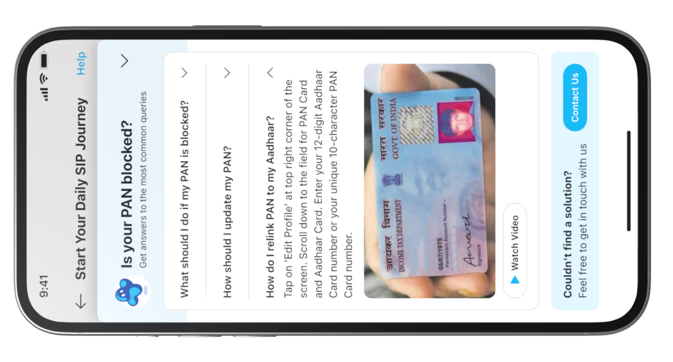
Although this journey occurs after the end of the funnel, we continued improving the post-investment experience based on feedback from the users via customer support team and stakeholders. Initially, we overlooked providing users with confirmation of completing the onboarding process and a summary of their purchase—features common in other Paytm products. Feedback also revealed confusion about the "skip day," when SIP processing is paused due to NPCI's mandatory cool-off period or weekends. Additionally, Non-KRA users faced delays of 2-3 working days for KYC verification, impacting their onboarding experience. To address these issues and other scenarios, we revamped the post-investment experience entirely.




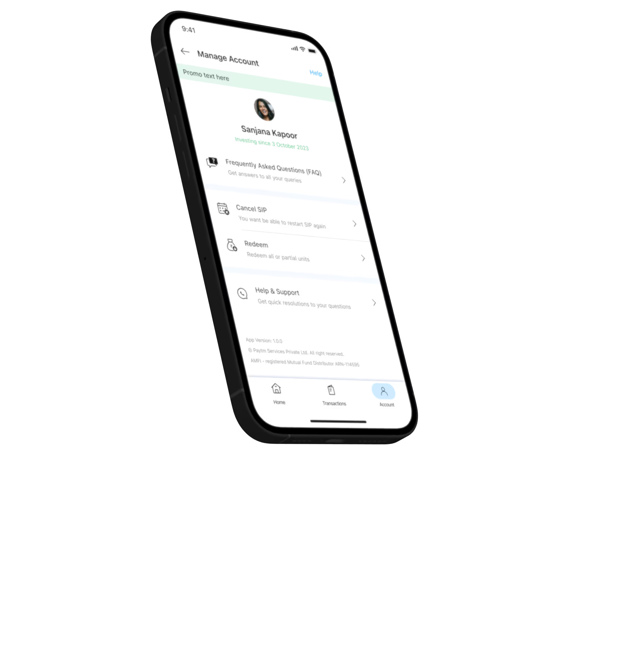
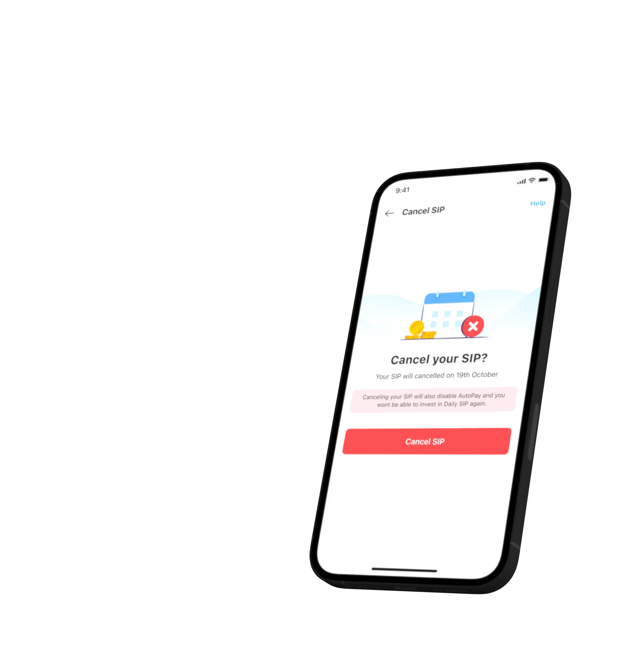
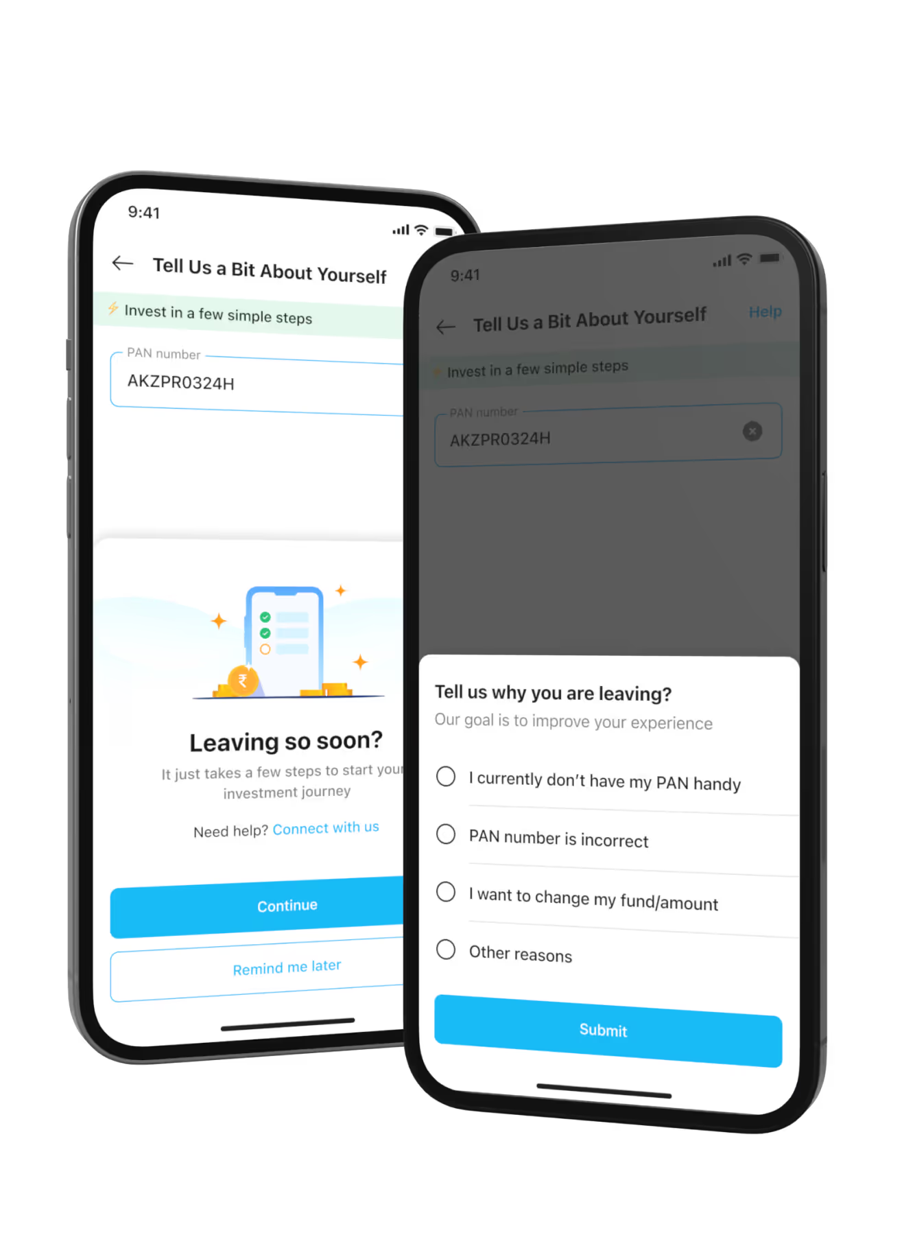
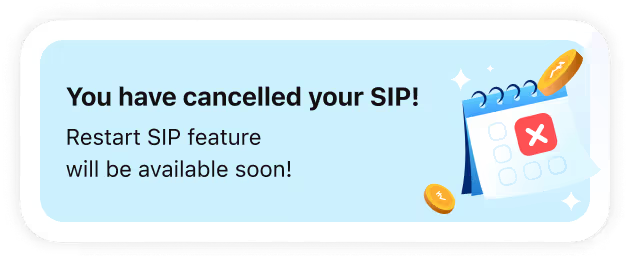
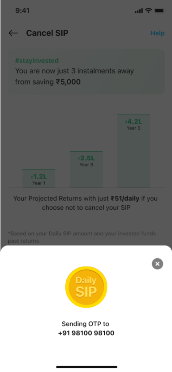
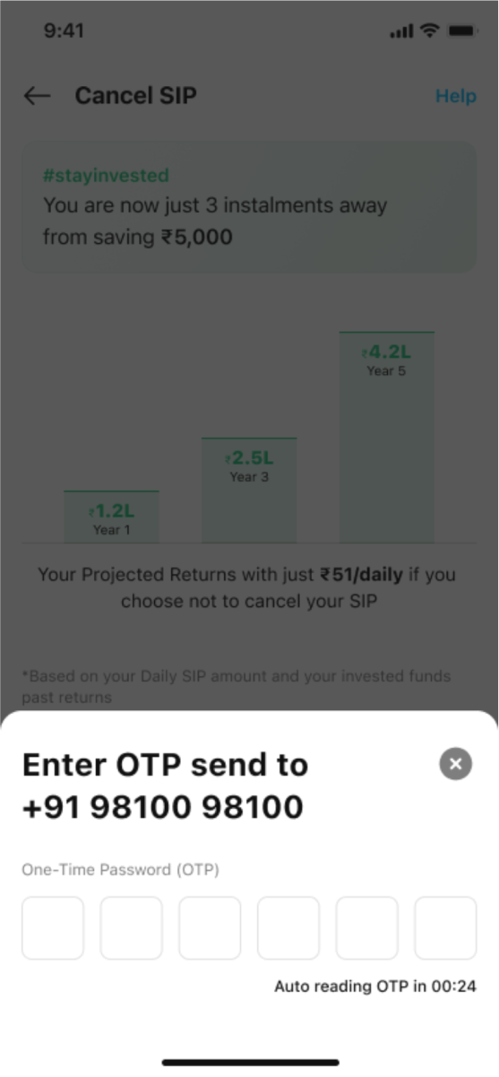
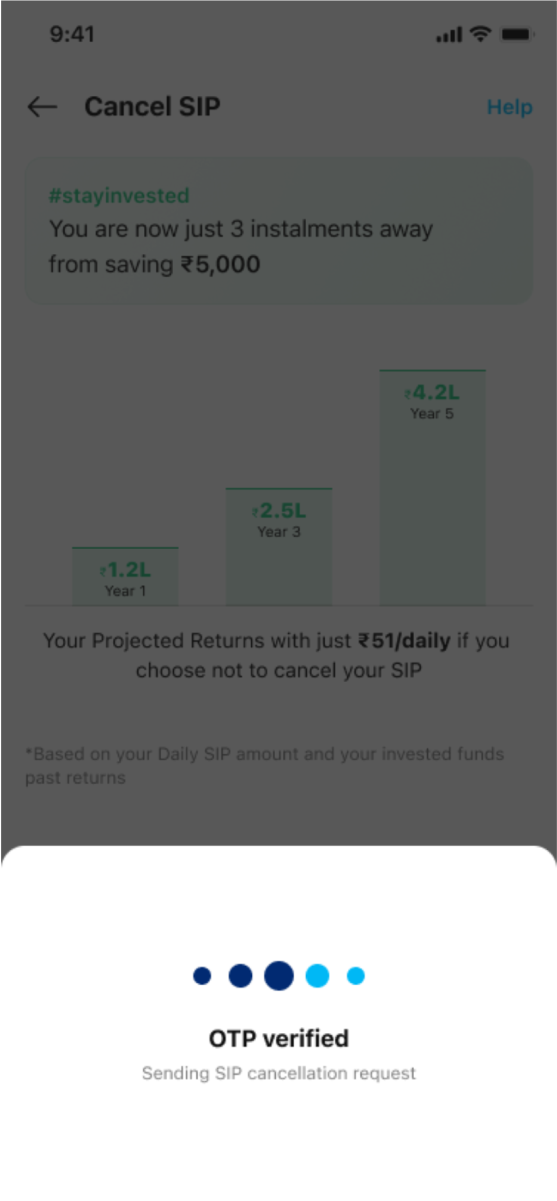
Beyond onboarding, a key metric we tracked was the number of users canceling their active Daily SIPs. No matter how many users we onboarded, our efforts would be wasted if the "bucket" was leaky. To tackle this, the CS team actively gathered feedback from users after cancellations. Issues like confusion around skip days and weekend scenarios were resolved through updates to the post-investment experience. However, challenges like poor returns or insufficient balance were beyond our control. A significant spike in cancellations occurred when the RBI revoked Paytm Bank’s banking license. Rumors spread that the entire Paytm app might shut down, prompting users to cancel their SIPs and withdraw investments.
To address the other issues, we created a flow asking users for the reason behind their SIP cancellation, followed by content explaining why they should reconsider. The design focused on user education, building trust, creating friction to reduce drop-offs, showcasing the product’s value, and using reverse psychology. However, before I could finalize and launch these designs to the live app, I was reassigned to the Paytm Money product.
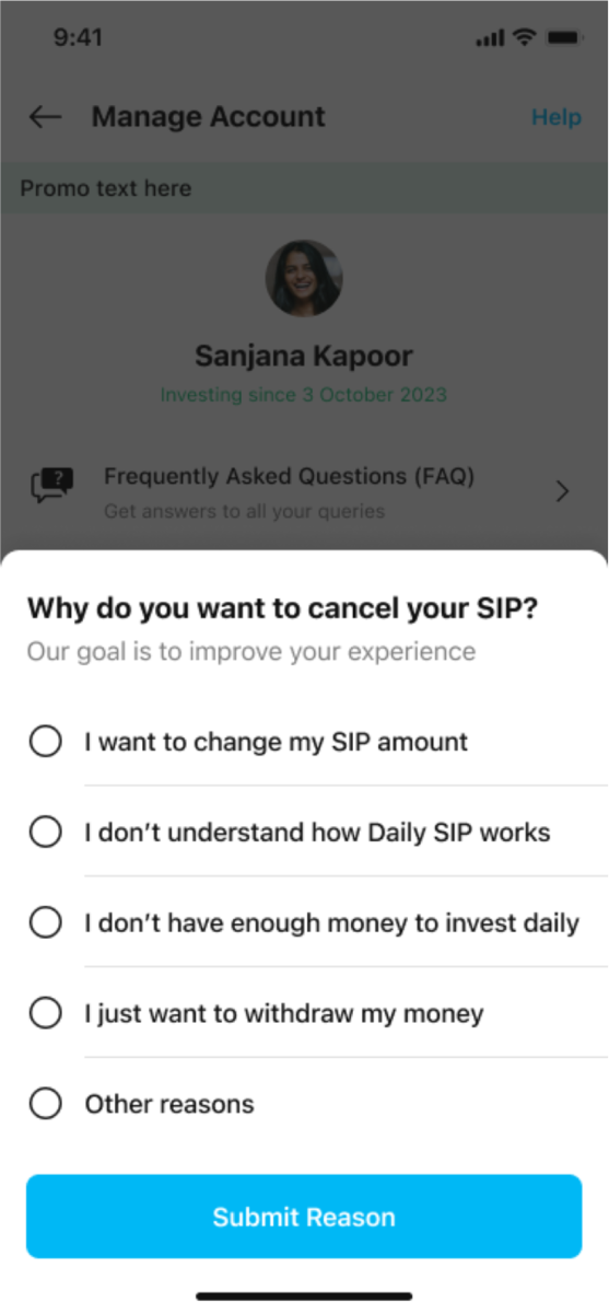
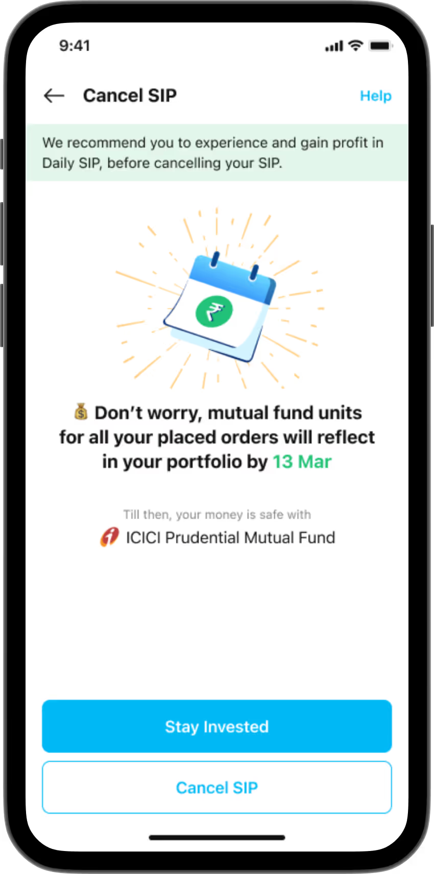
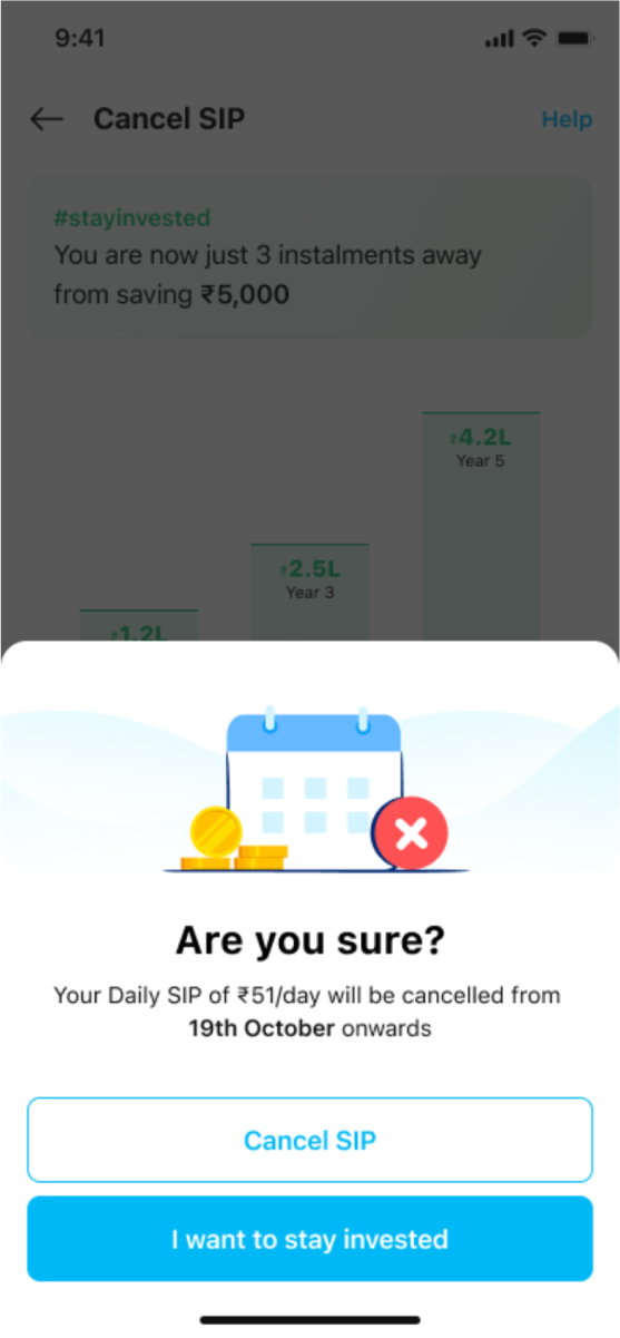
The development of Paytm's Daily SIP product was driven by a user-centered design process. After my manager's transition to different department, I lead the design process end to end, from December to March, ensuring the design aligned with user needs and business goals. I introduced mandatory design UAT before each release and focused on continuous user feedback through A/B testing and insights from the CS team. We addressed key issues like SIP cancellations and post-investment clarity, making iterative design improvements based on user behavior.
In March 2024, I transitioned to Paytm Money. To ensure a smooth handover, I worked with three designers from the Paytm central team, providing them with a user-centered approach to maintain project continuity. Daily SIP remains my favorite project due to the open, data-driven team and the focus on optimizing the user experience, leading to impressive results within the Paytm ecosystem.